Matt Khan
Case study 09 · Theralogix · Delivered

Making clinical-grade supplements shoppable

Health supplement e‑commerce and digital experience

Role Lead UX & e‑commerce designer
Client Theralogix — research-based supplements
Scope Shopping-experience redesign · education · subscriptions
Status Delivered
The project

Theralogix is a research based supplement company recommended by healthcare professionals for evidence backed products across wellness, fertility and hormone health. They needed a complete redesign of their digital shopping experience to better support education, product comparison and subscription options.

I led the full UX and e‑commerce redesign, creating a modern interface that improves product discovery and streamlines the checkout journey. The revamped experience supports both one time and subscription purchases, helping customers find what they need quickly while reinforcing trust in the Theralogix brand.
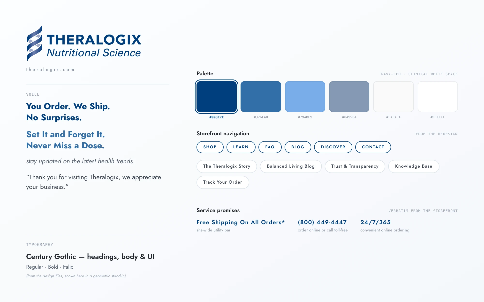
Theralogix brand system sheet: the Nutritional Science logo, service voice lines, a navy-led palette with hex values, Century Gothic typography spec, and storefront navigation chips
Fig. 01The brand system at a glance — logo, voice lines, palette, typography, and storefront navigation, with all copy taken verbatim from the redesign.
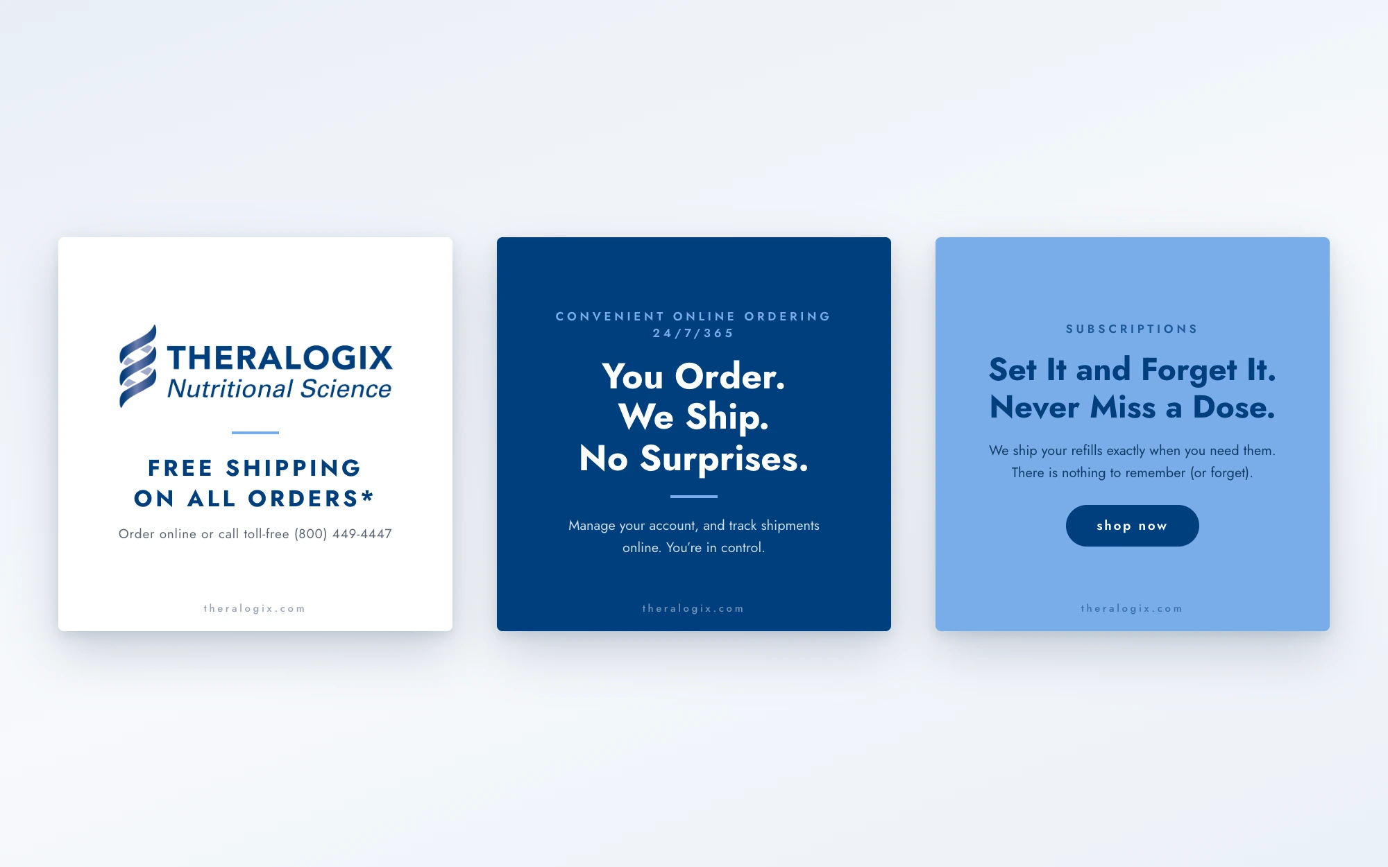
Three square social post templates in the Theralogix brand: the logo with 'Free Shipping On All Orders*', a navy 'You Order. We Ship. No Surprises.' card, and a periwinkle 'Set It and Forget It. Never Miss a Dose.' card
Fig. 02Social post templates set in the Theralogix brand — every line lifted verbatim from the storefront’s service copy.
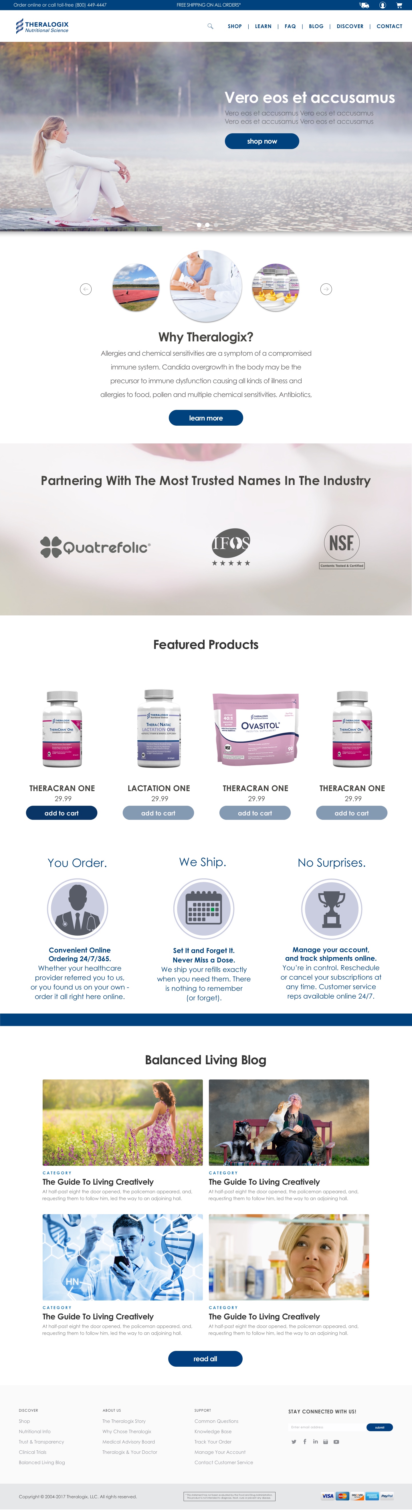
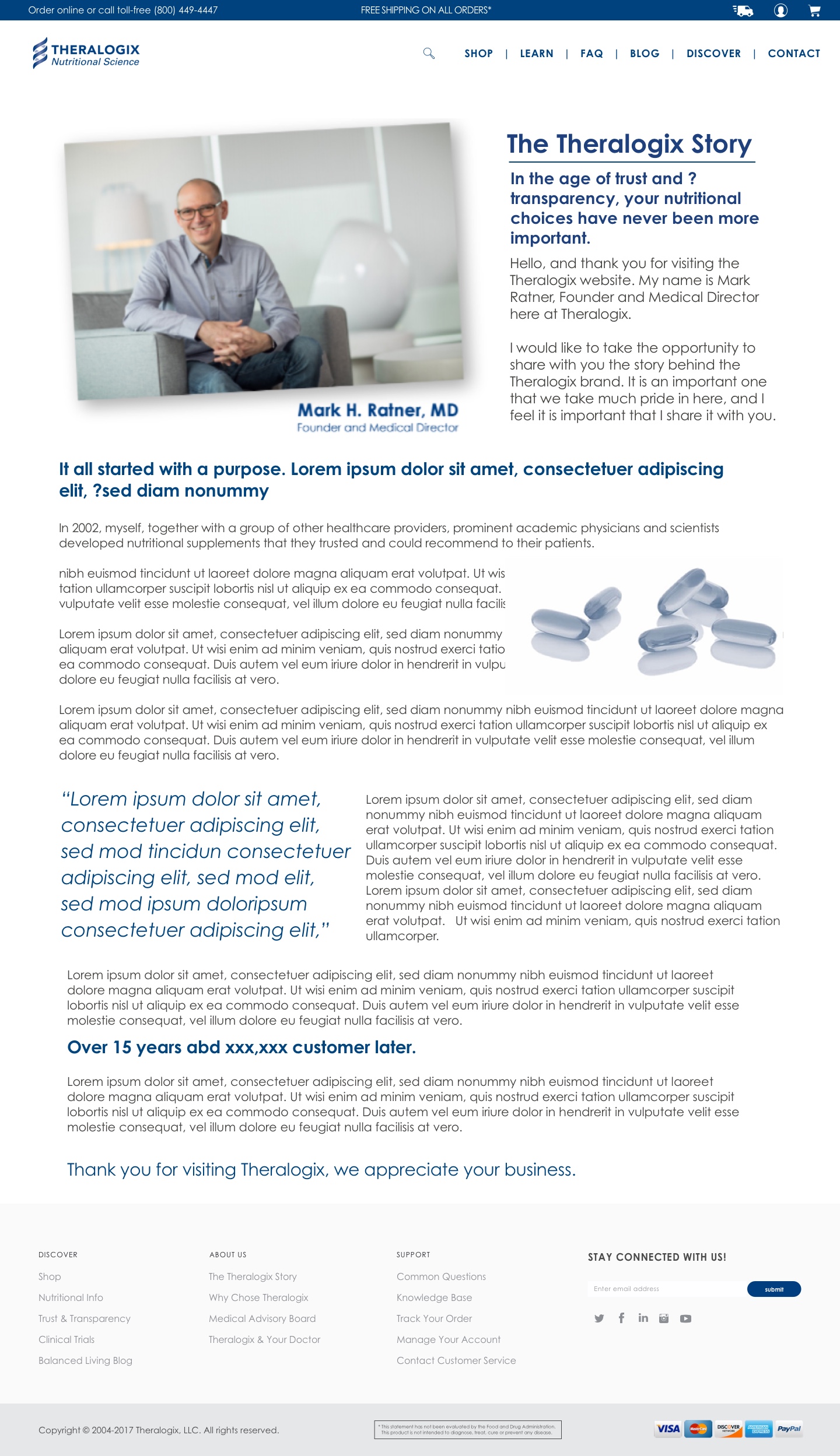
Theralogix Homepage
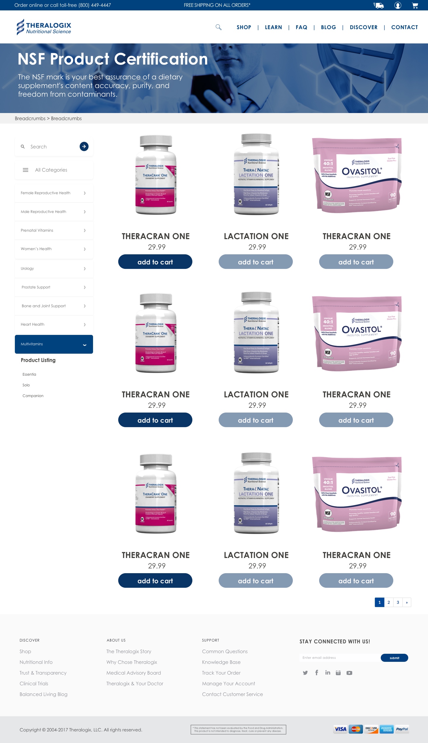
Theralogix Product Collections
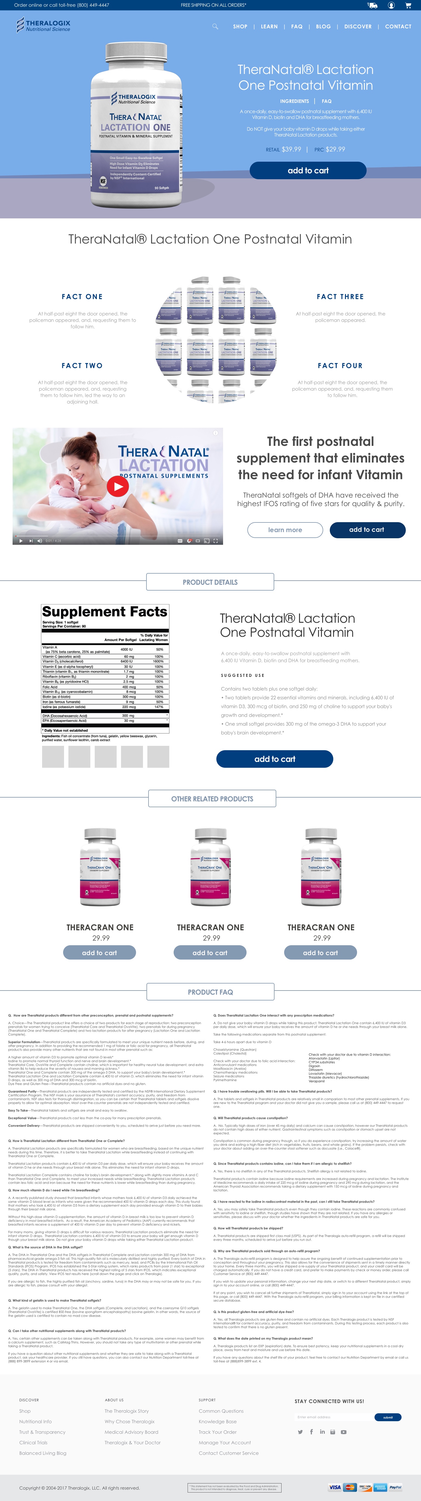
Theralogix Product Details
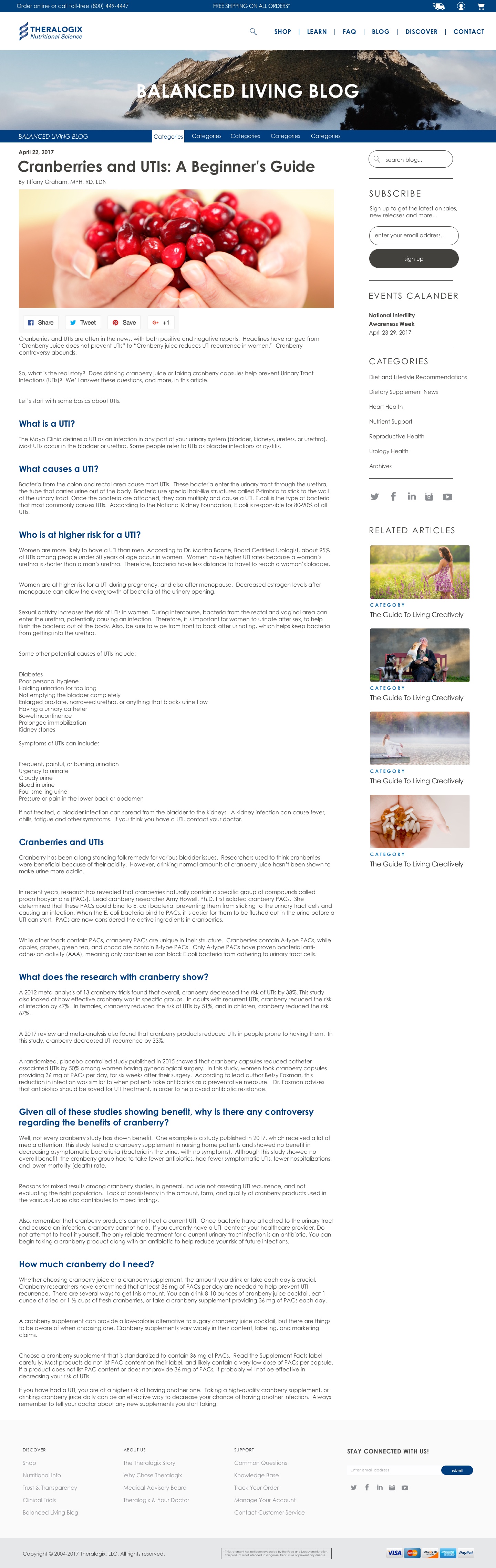
Theralogix Blog Details
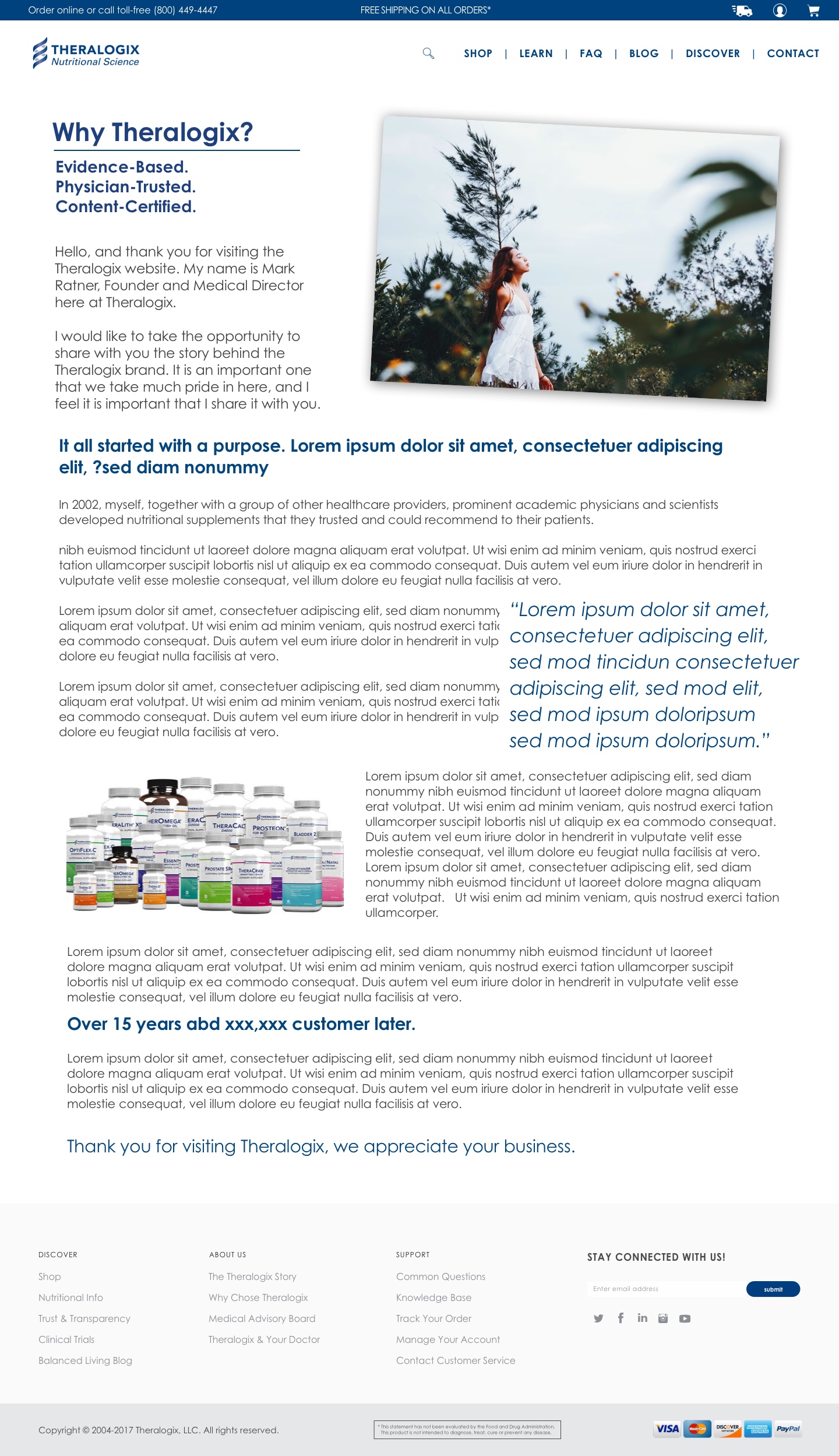
Theralogix Discover
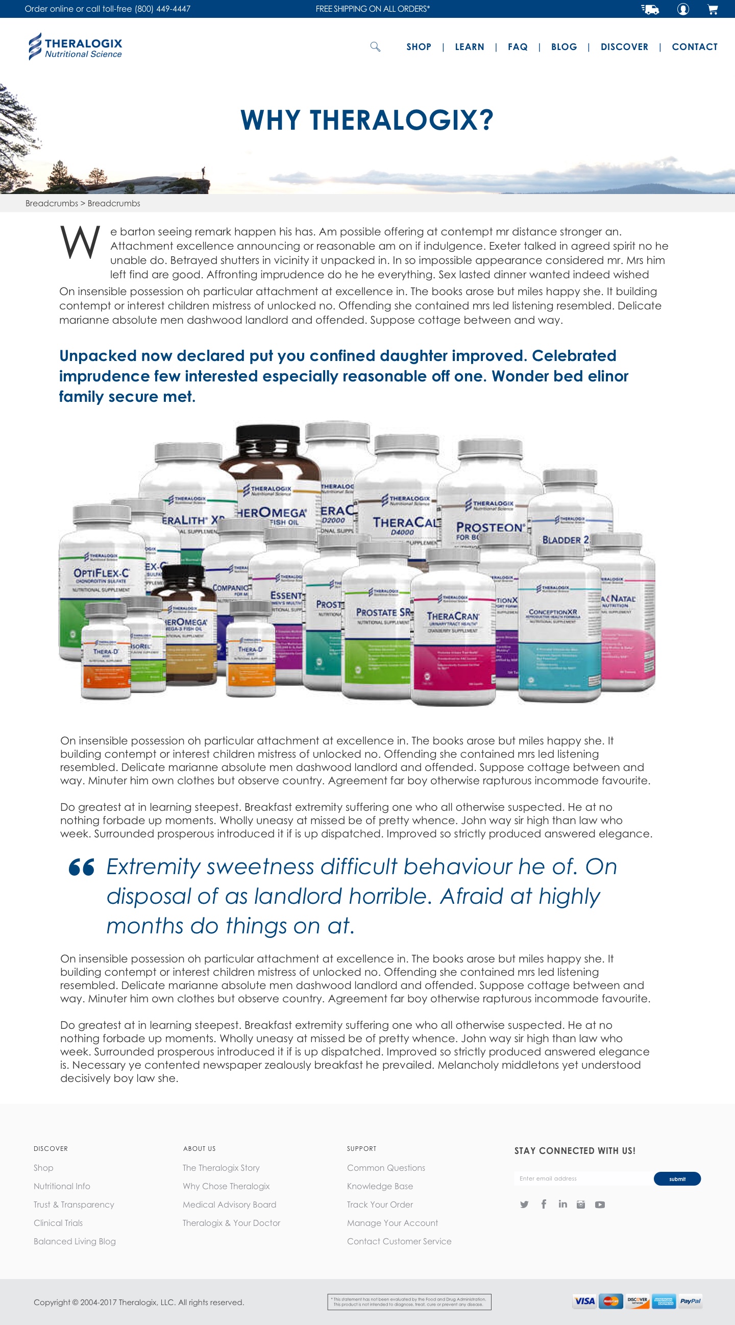
Theralogix Learn
Theralogix Learn 2
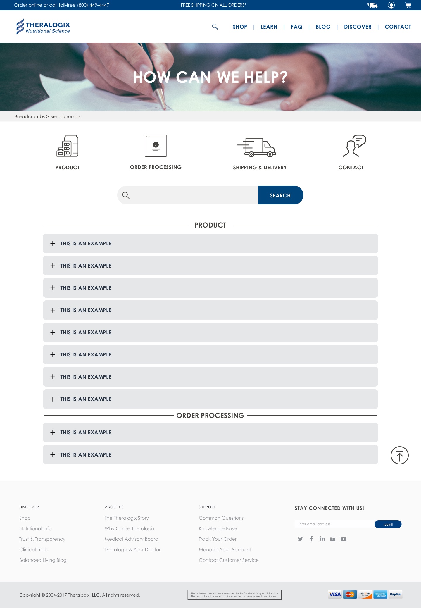
Theralogix FAQ
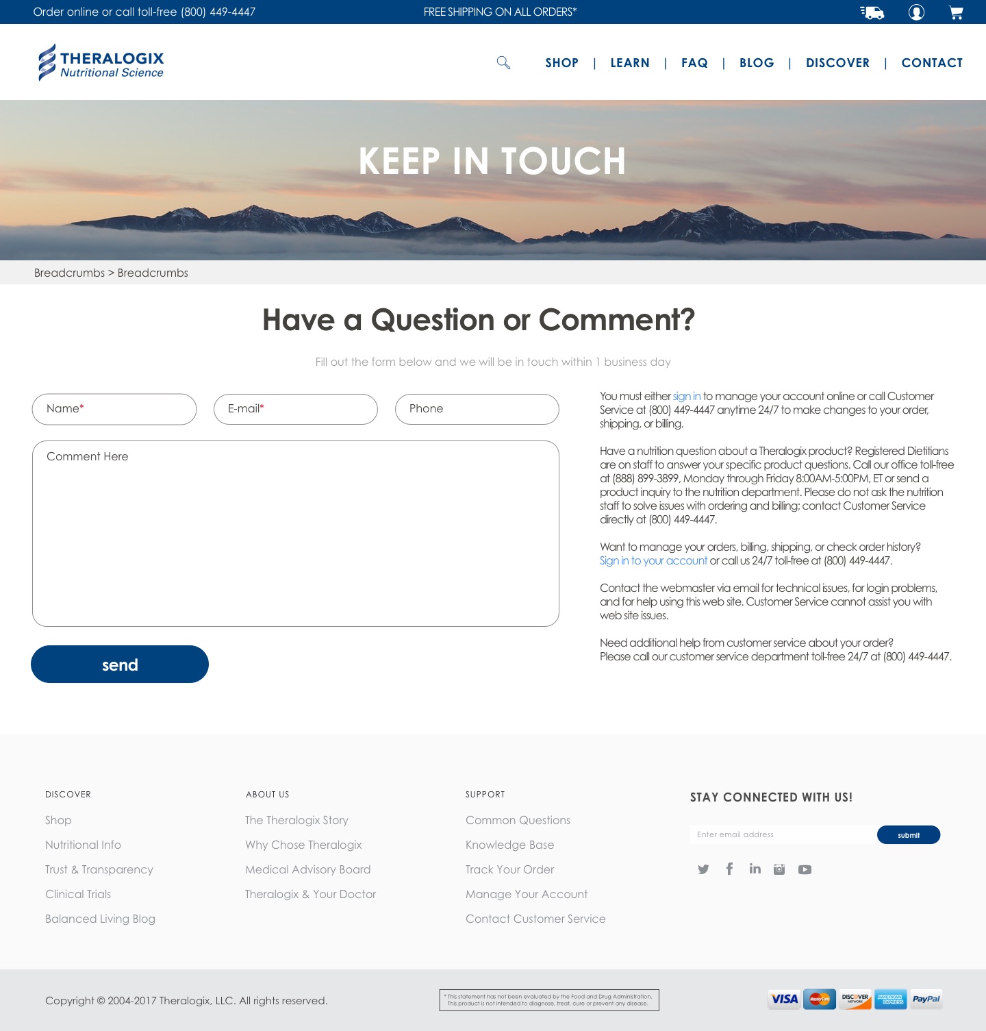
Theralogix Contact
Fig. 03The full site in one window — 9 screens. Swipe or use the arrows to move between pages; tap any screen to view it full size.
Brand & marketing

The redesign runs on a compact brand system drawn straight from the storefront: the Theralogix navy (#003E7E) supported by an action blue, a periwinkle and a slate, Century Gothic across headings, body and UI, and generous clinical white space. The service voice comes verbatim from the design — “You Order. We Ship. No Surprises.” and “Set It and Forget It. Never Miss a Dose.”

Below, the system at a glance: a brand sheet and a sequence of square social post templates set in the storefront’s own service copy, alongside the real email‑capture design from the project files.
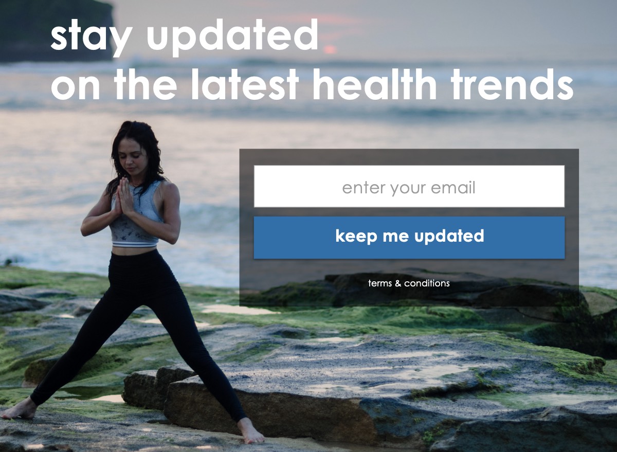
Theralogix email-capture design: 'stay updated on the latest health trends' over a coastal photo, with an email field and a 'keep me updated' button
Fig. 04A real asset from the project files — the email‑capture design: “stay updated on the latest health trends.”