Brand & Digital
Green Haven
Identity, brand book, and website for a Main Street wellness studio
Brand & Digital
Identity, brand book, and website for a Main Street wellness studio
Brand strategy, identity, web design & build
2026
Identity, brand book, asset kit, website
Green Haven is a wellness sanctuary in the small historic town of New Market, Maryland — vinyasa, restorative and yin yoga, sound baths, breathwork, seasonal ceremonies. It needed everything a new local business needs at once: a name given form, a brand system, and a website that could carry its calm, rooted personality online.
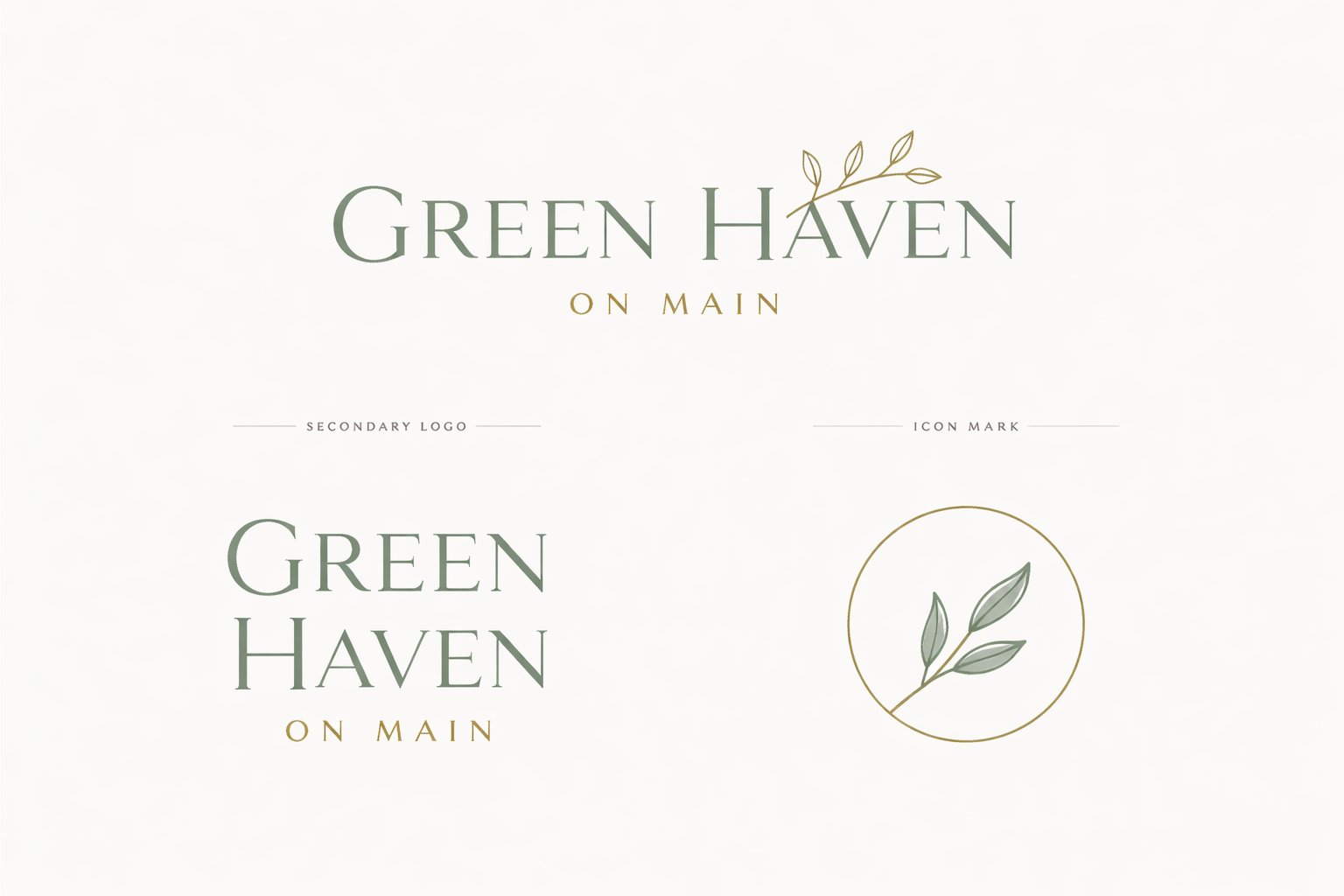
The engagement delivered the brand identity and full asset kit, a documented brand system, social content templates, and the designed and built website — everything a new business needs on day one.
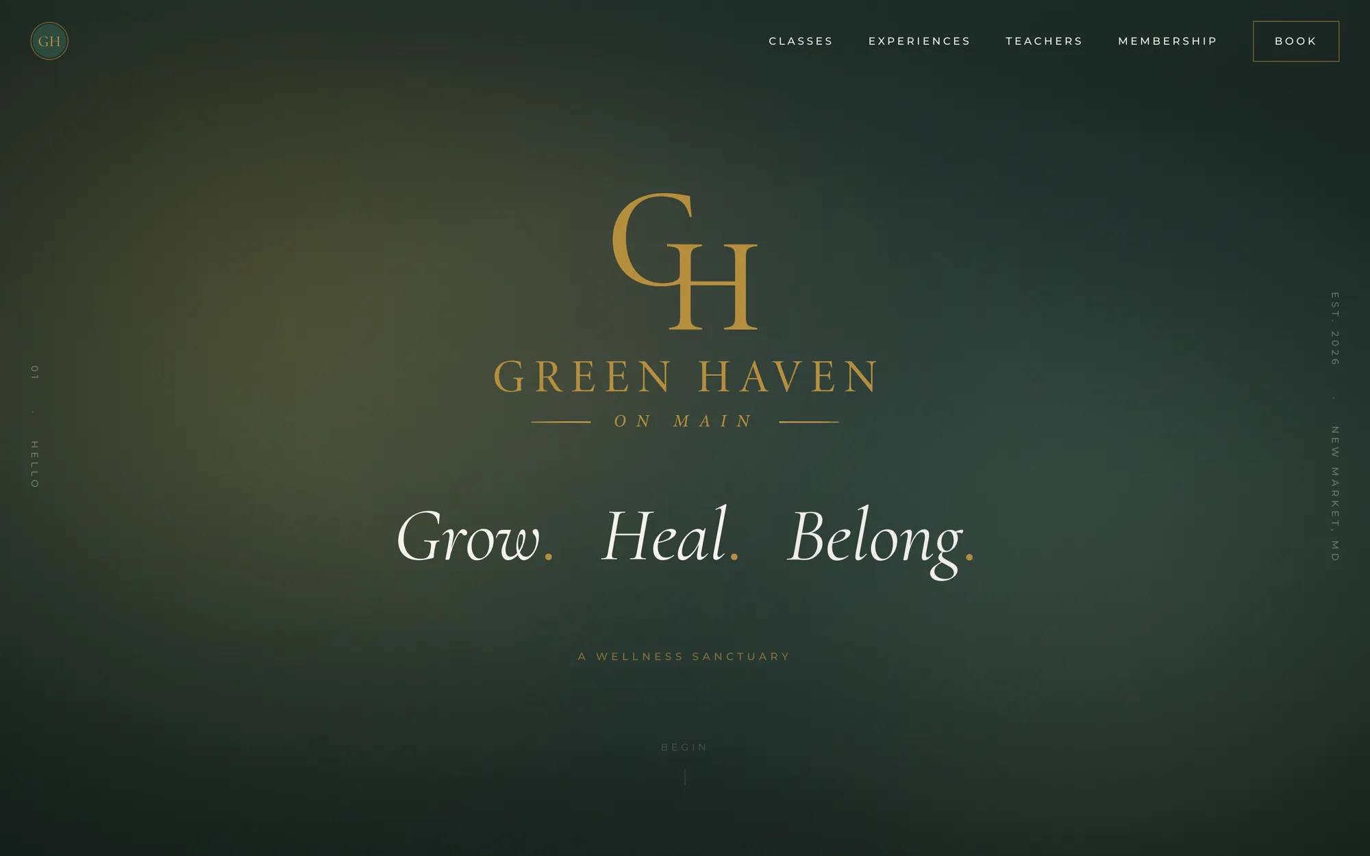
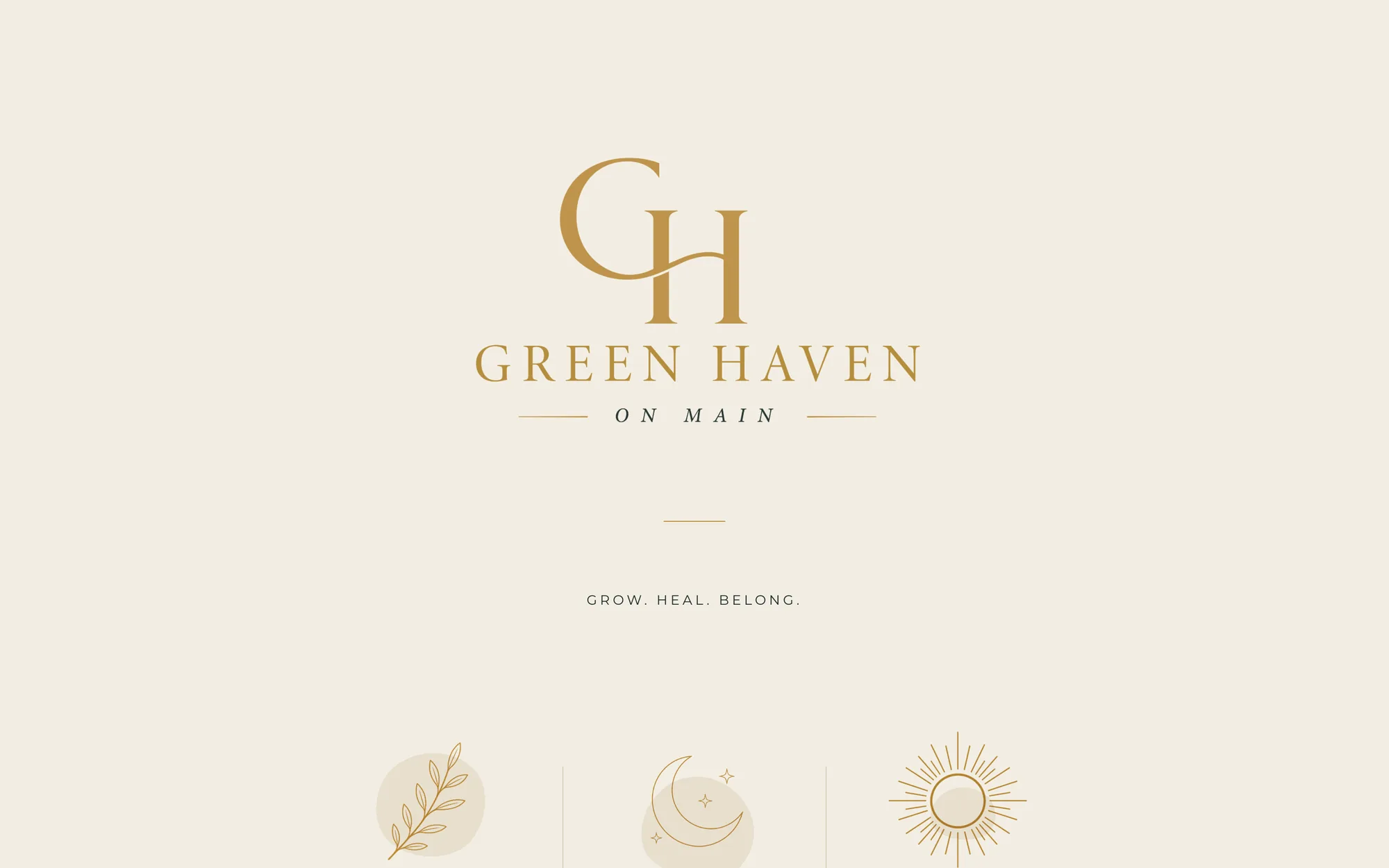
The identity is built on three words — Grow. Heal. Belong. — expressed through deep forest green, warm gold, and soft cream, with sage, clay, and slate accents. Cormorant carries headlines; Montserrat handles everything functional.
The mark family — a tree-pose figure, a lotus, circular monogram stamps — each has a defined use, documented in a delivered brand book.

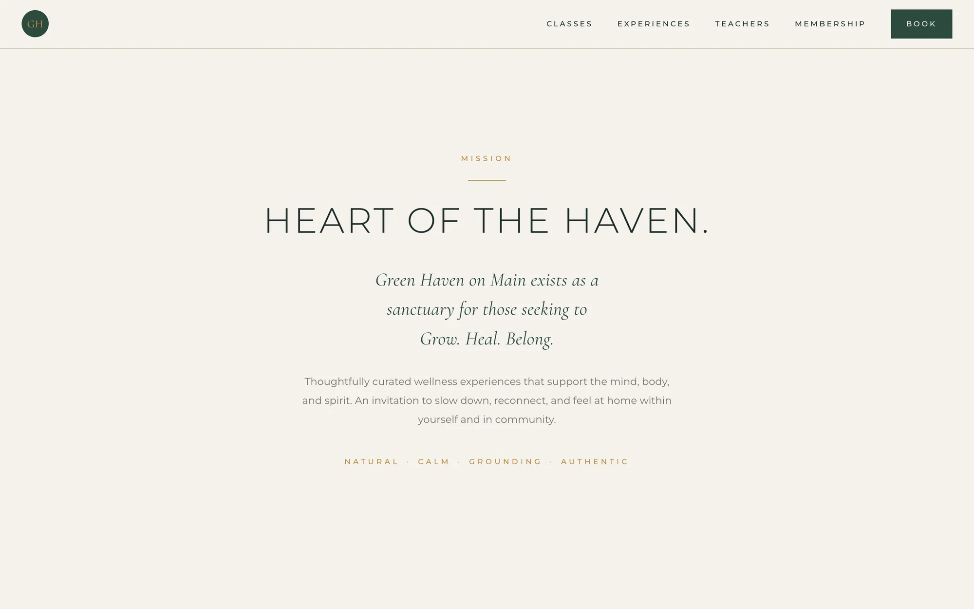
The site is a single cinematic page: a dark forest-green hero, then classes, experiences, teachers, membership, and visiting information — organized so a first-time visitor can answer "what is this place, and how do I start?" in one scroll.
Built as fast, dependency-free HTML and CSS: nothing to maintain, nothing to break. Booking and commerce were scoped content-first for launch — clear calls to action rather than embedded scheduling software.

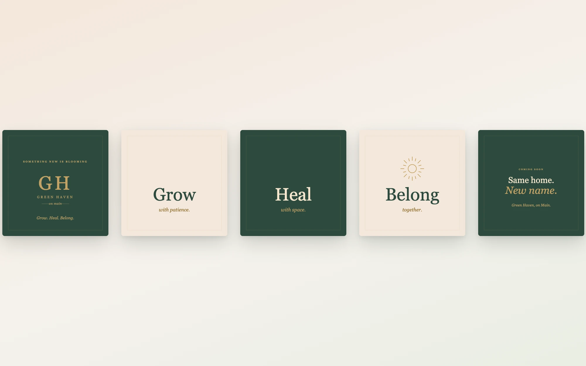
The go-to-market side shipped as social templates and a five-slide Earth Day teaser carousel announcing the rebrand — the three brand words paced one per slide, ending on the reveal: "Same home. New name."
Treating the identity and the website as one system — same words, same palette, same restraint — is what makes a small business feel bigger than it is. Launching content-first, with booking as a clear call to action rather than embedded software, matched the studio's actual operating maturity: design scoped to the business, not the other way around.