Brand & Live Ordering · Live
The Crab Trap
Brand identity, mobile-first website, and live Clover ordering for Maryland's premier crab cake food truck
VIEW LIVE SITE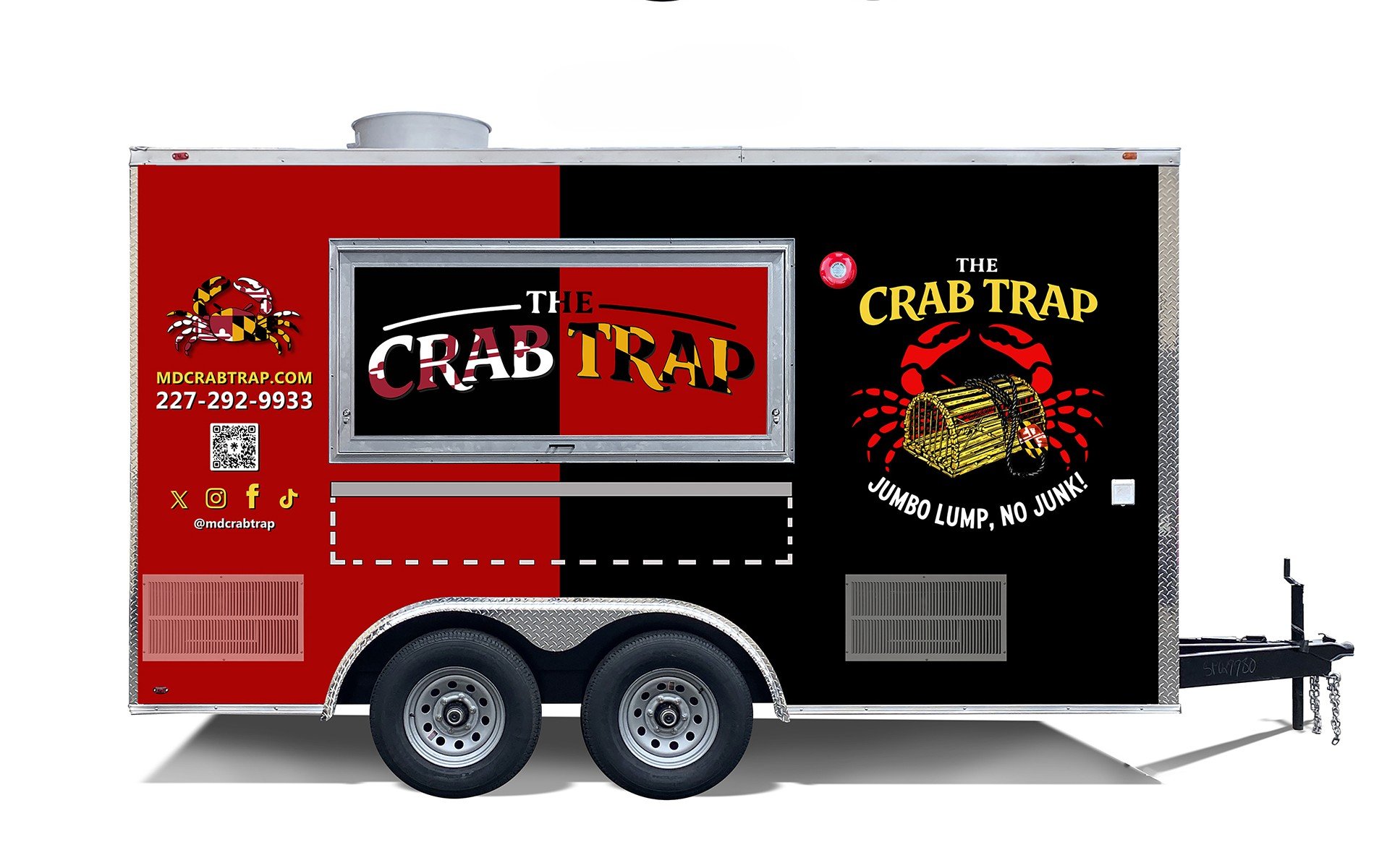
Brand & Live Ordering · Live
Brand identity, mobile-first website, and live Clover ordering for Maryland's premier crab cake food truck
VIEW LIVE SITE
Brand identity, web design & build, POS integration
Food truck — Rockville, MD
Live
The Crab Trap brings the signature Maryland jumbo lump crab cake to Montgomery County. Its customers are on their phones — standing in line, or deciding whether to drive over — so the whole experience was designed mobile-first, with the menu and ordering wired directly to the truck's register. Jumbo Lump. No Junk.
The work covered the full stack of a small food business's presence: brand identity from rough concept to final badge, a mobile-first website, and a Clover point-of-sale integration handling live menu, ordering, loyalty, and hours.
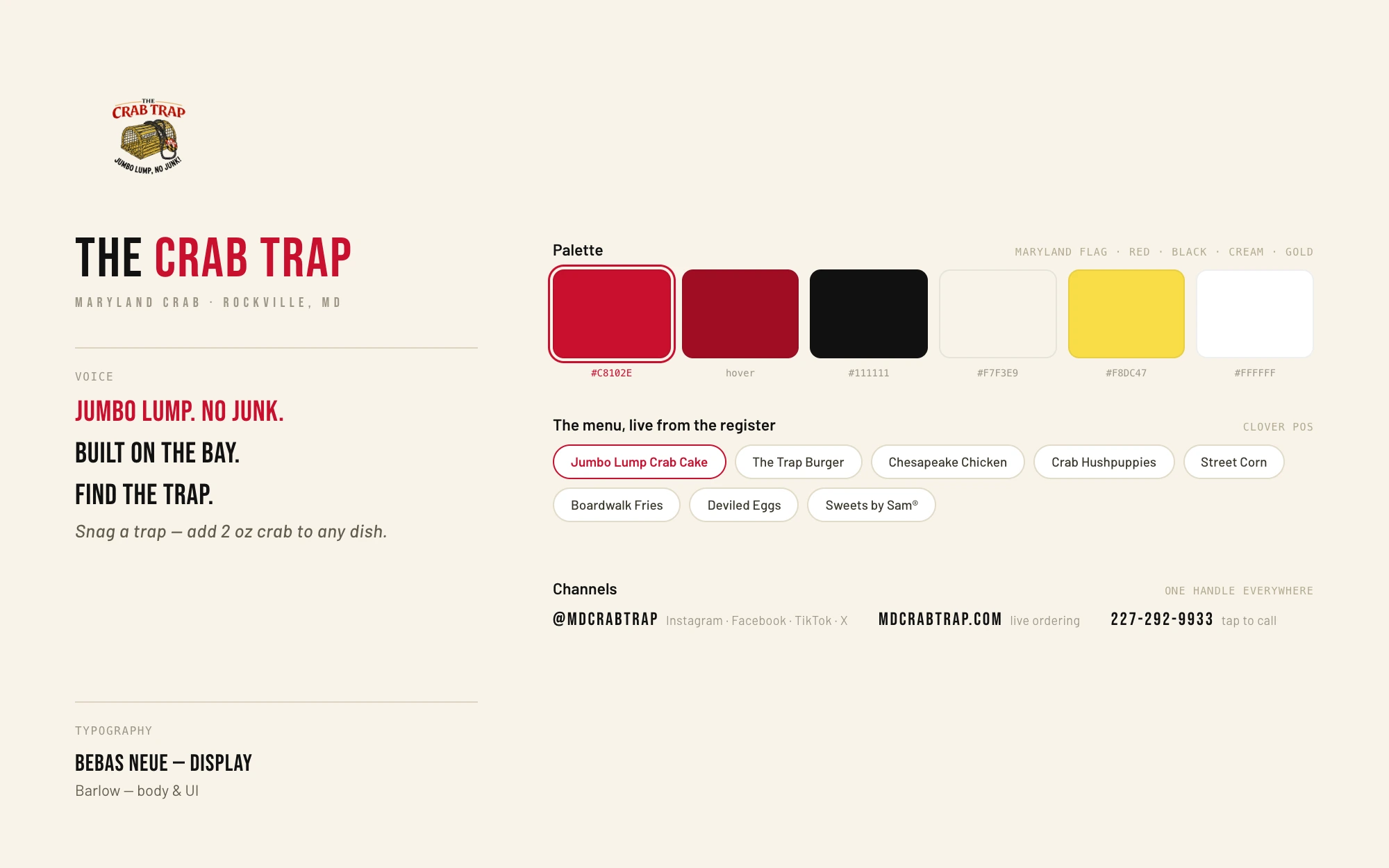
A Maryland-flag-inspired palette of red, black, cream, and gold; Bebas Neue display type; and a circular cream badge built to read on a truck, a sign, and a favicon alike.
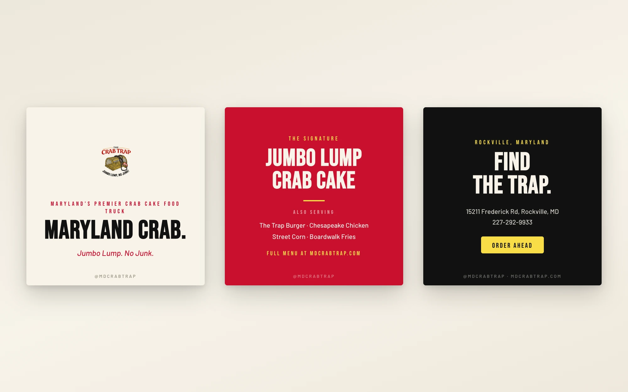
The marketing system is deliberately small and loud: one handle — @mdcrabtrap — across Instagram, Facebook, TikTok, and X; a share card that's the truck itself; an email-and-rewards capture on the homepage; and structured data with live opening hours so local search works like a marketing channel. The social templates set the site's own copy in the brand's Bebas-and-Maryland-flag voice, so a post, the truck wrap, and the website all read as one thing.
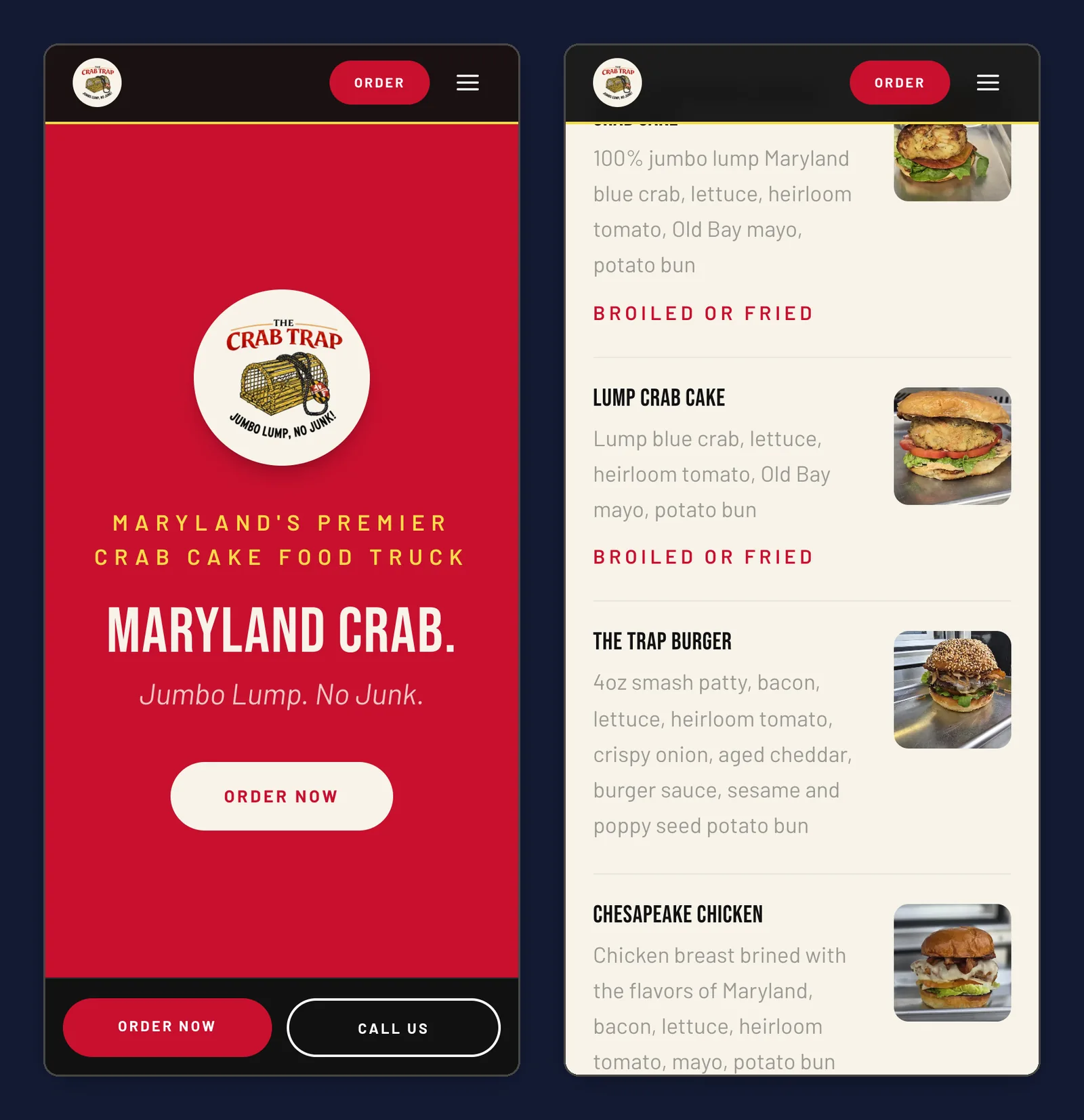
The homepage leads with the two things a hungry visitor needs: what this is, and an Order Now button. On a phone, a persistent Order / Call bar stays pinned to the bottom of the screen and every menu row is a tap target.
The menu isn't hardcoded — items and prices come live from the truck's Clover register, so the site can never disagree with the kitchen. For a food truck, location and hours are the product: the Find the Trap section keeps them one scroll from anywhere.
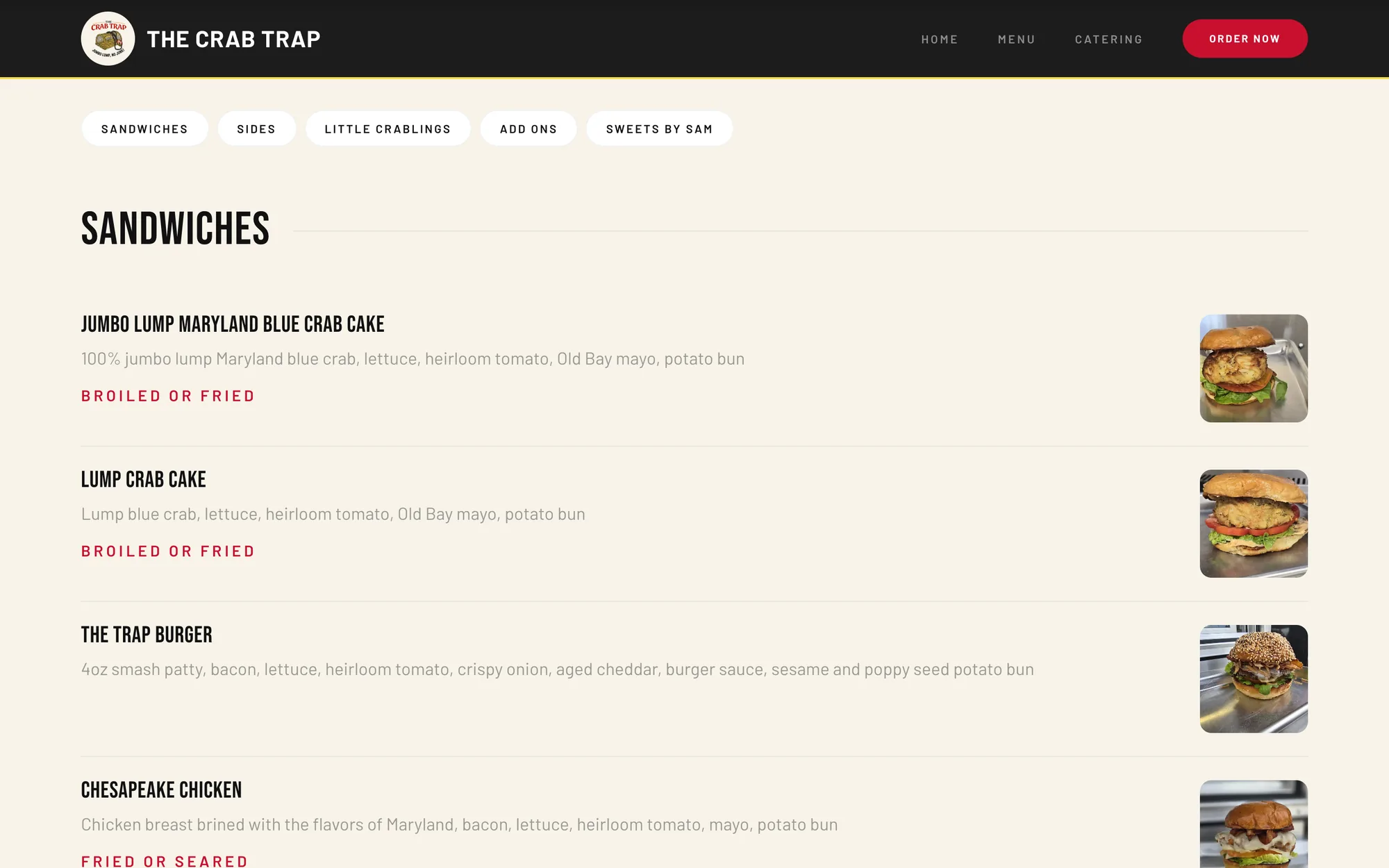
The site integrates directly with the truck's Clover point of sale: order-ahead flows through Clover's hosted checkout, loyalty rewards are wired in, and ordering automatically respects business hours — with a one-tap pause switch the owner can flip when the line gets too long. When ordering is off, every call to action falls back to tap-to-call.
Local search was treated as a feature: structured data with live opening hours, so the truck shows up correctly when someone searches for crab cakes nearby. Accessibility was iterated on the live product — menu rows are full-width tap targets and text contrast was tuned to WCAG AA during post-launch refinement.
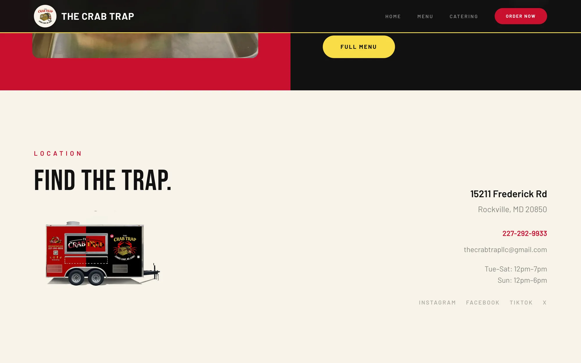
A food truck's UX problem is time: every second between hunger and order matters. Wiring the menu to the register, pinning the order bar, and letting the owner pause ordering with one tap all serve the same insight — the site is part of the service line, not a brochure for it.