Simplifying real‑estate search for a multi‑state MLS
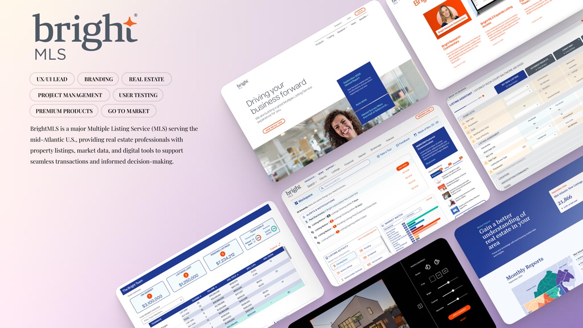
Bright MLS is one of the largest multiple listing services in the U.S., serving 100,000+ real‑estate professionals and 250,000+ transactions annually across nine states and Washington, D.C. As Lead Product Designer, I helped it evolve from a data provider into a product organization — introducing a repeatable UX practice, validating new product concepts, and unifying five platforms under one design system.
The problem: shifting priorities, little UX structure, and a platform mid‑migration from 2.0 to 3.0, serving professionals whose livelihood depends on it. My contribution: end‑to‑end product design — research, information architecture, a shared design system, and the design of new products from concept through go‑to‑market. The result: a structured, measurable UX practice; five platforms under shared standards; validated premium product concepts; and a redesigned core experience.
A platform professionals depend on, without a design practice to match
The year started with unclear processes and very little UX structure. Agents, brokers, and appraisers relied on Bright daily — to list, search, and close — but the experience had grown fragmented across products, and design decisions had no repeatable path from evidence to shipped work.
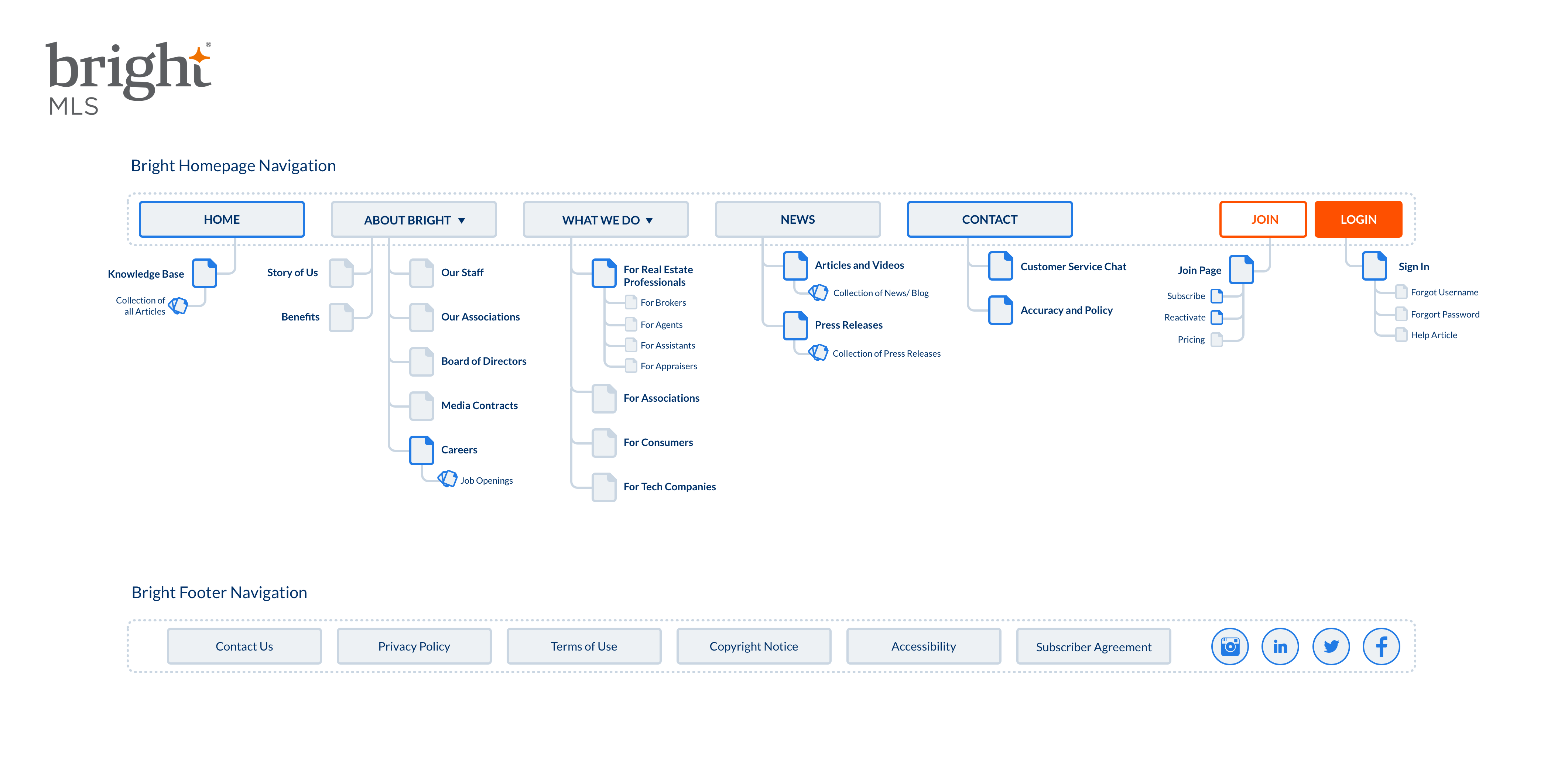
I began where the confusion was most visible: the information architecture. Mapping the existing homepage exposed duplication and dead ends, and gave the organization a shared picture of the problem.
Listening to the people whose livelihood runs through the platform
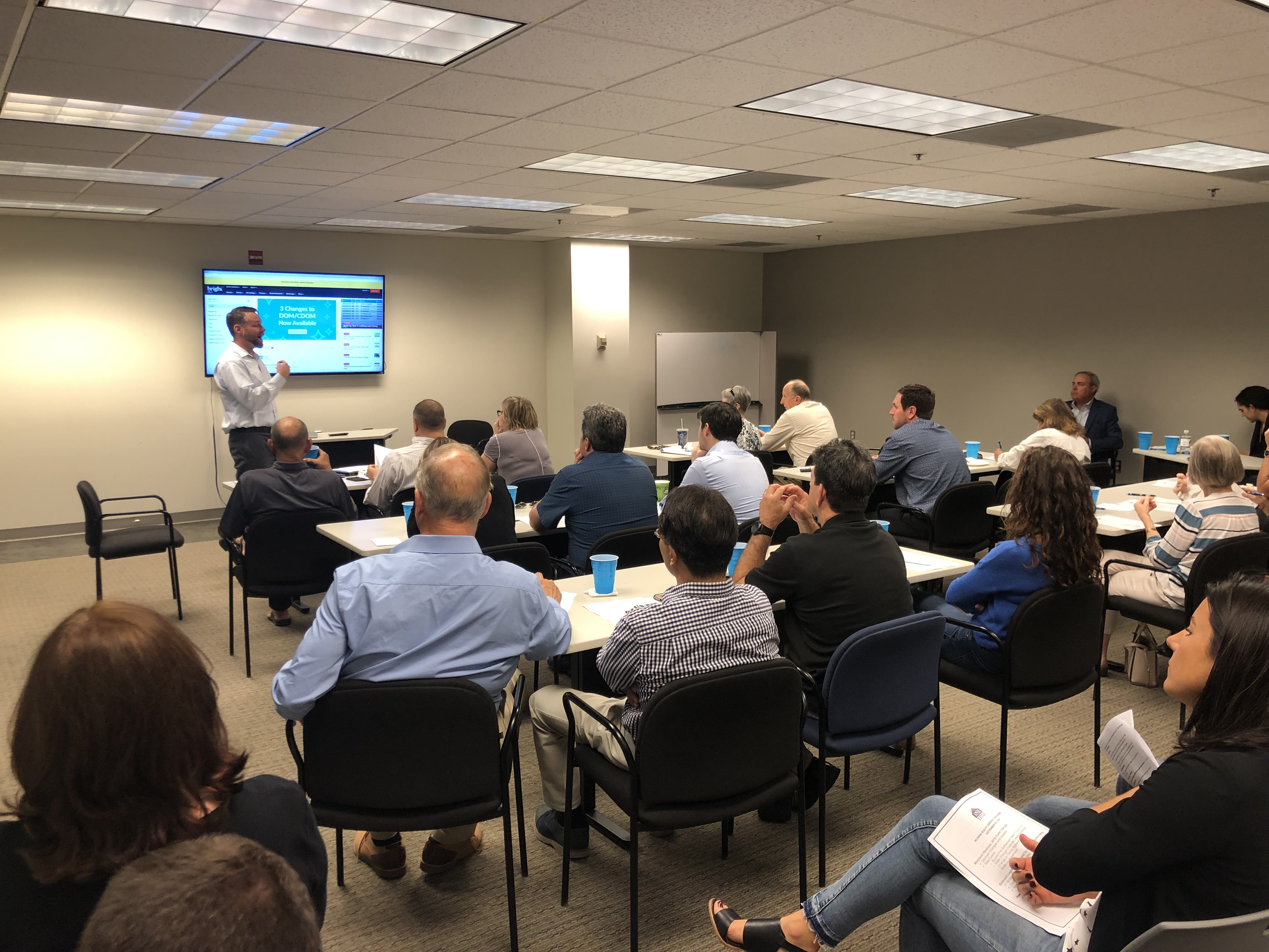
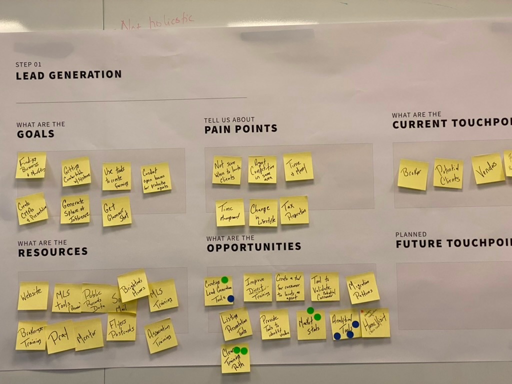
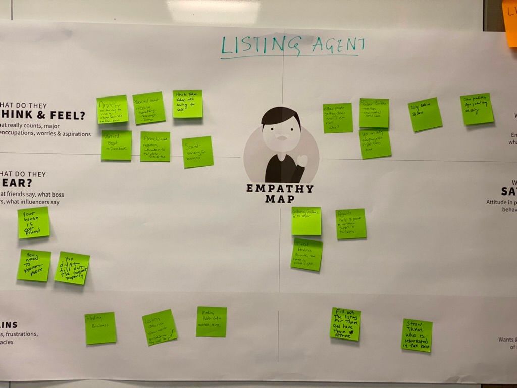
I led the research needed to uncover real pain points and bring UX into business operations: in‑depth conversations with brokers, agents, and appraisers; facilitated working sessions; validated personas; and concept testing that shaped what got built. The findings were direct — the UX process needed to be documented and repeatable, and mobile mattered more than the org assumed.

One system for five platforms
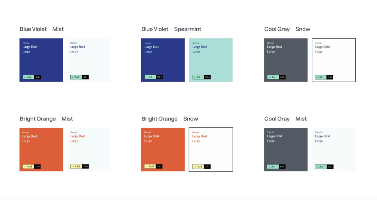
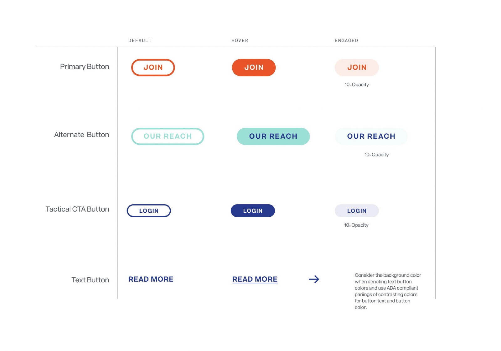
Fragmentation was the root problem, so the fix had to be systemic: documented color, type, and component standards that five platforms could share. Defined once, the system gave every product team the same building blocks — and gave design reviews an objective reference.
The front door, and everything behind it
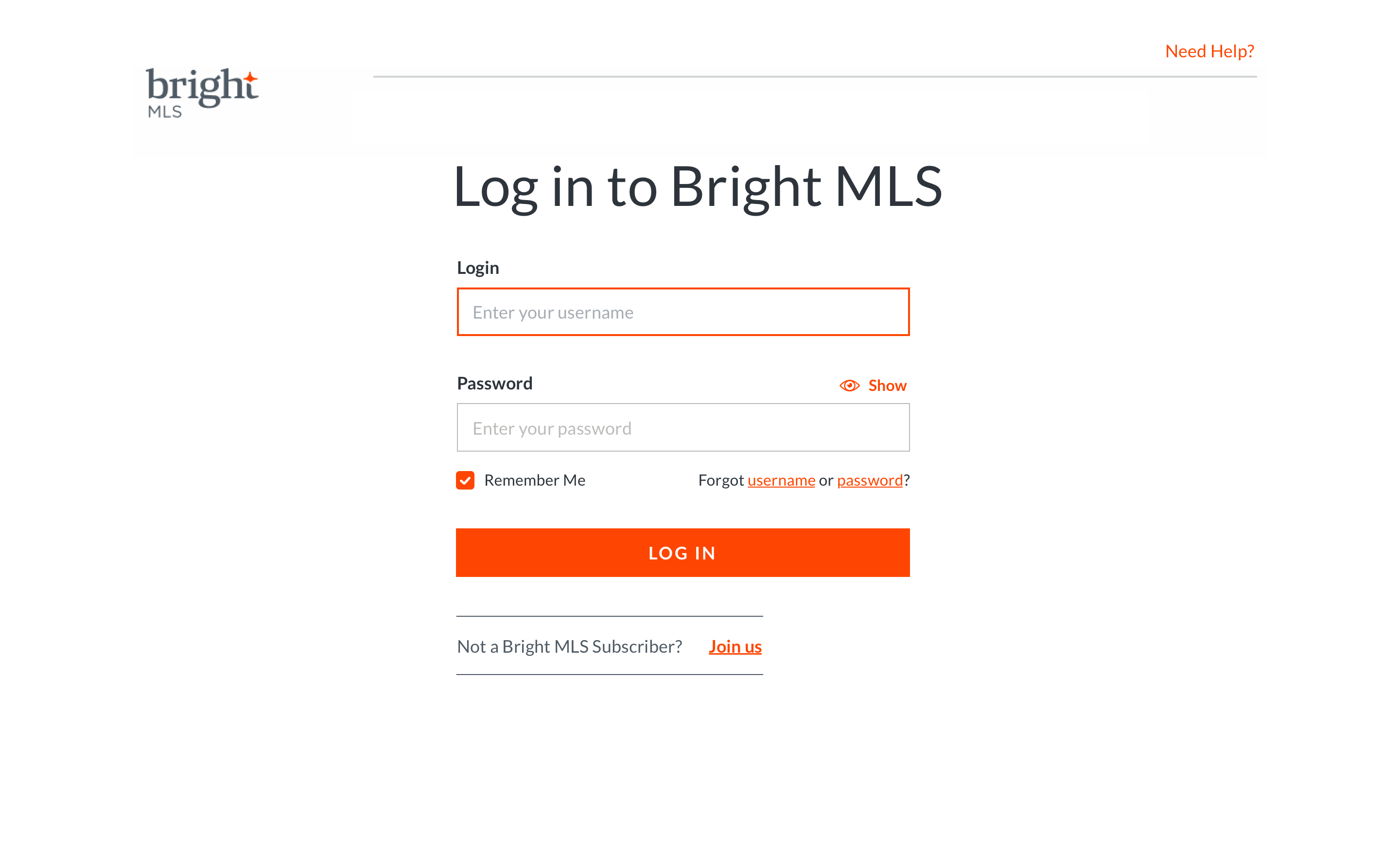
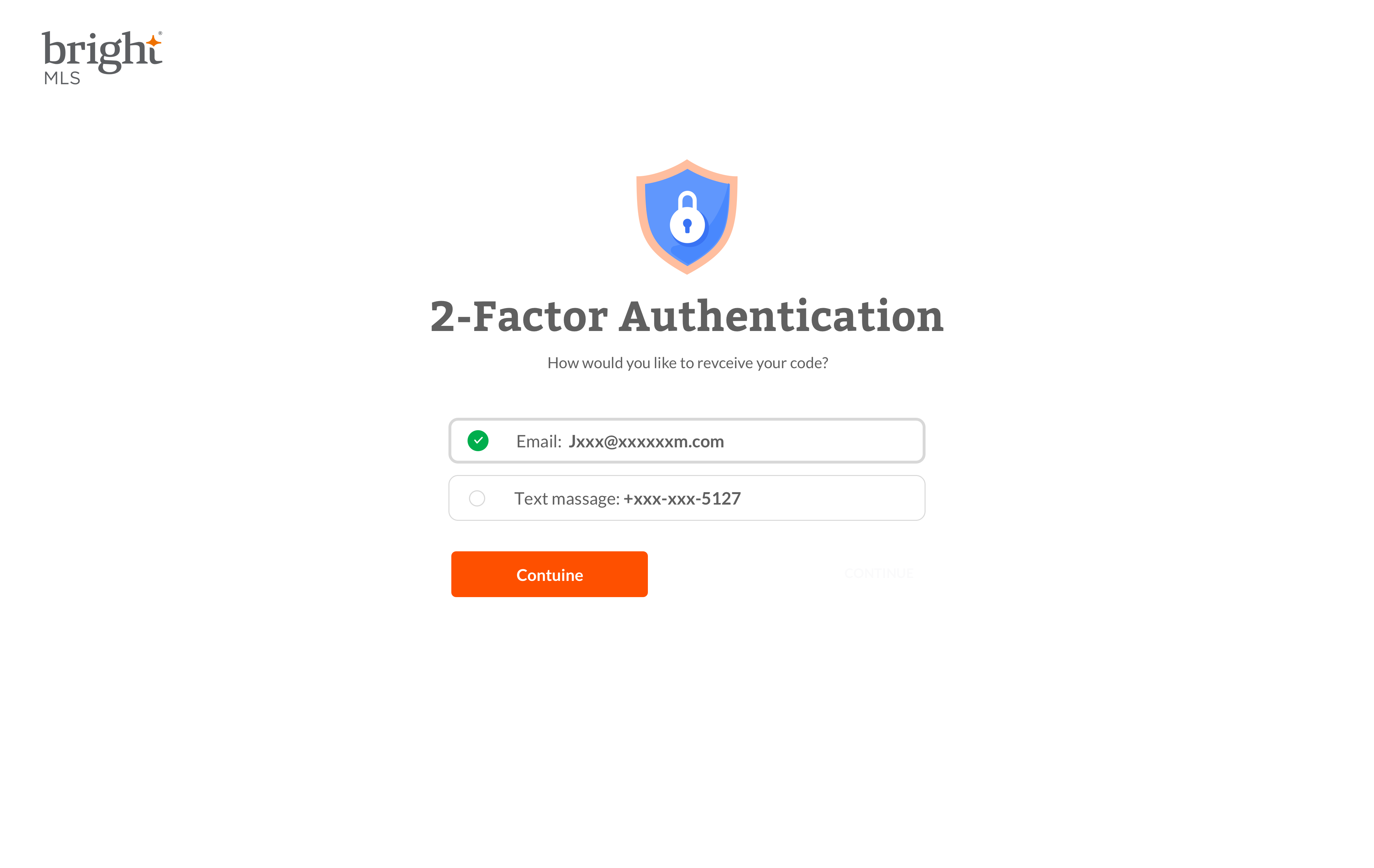
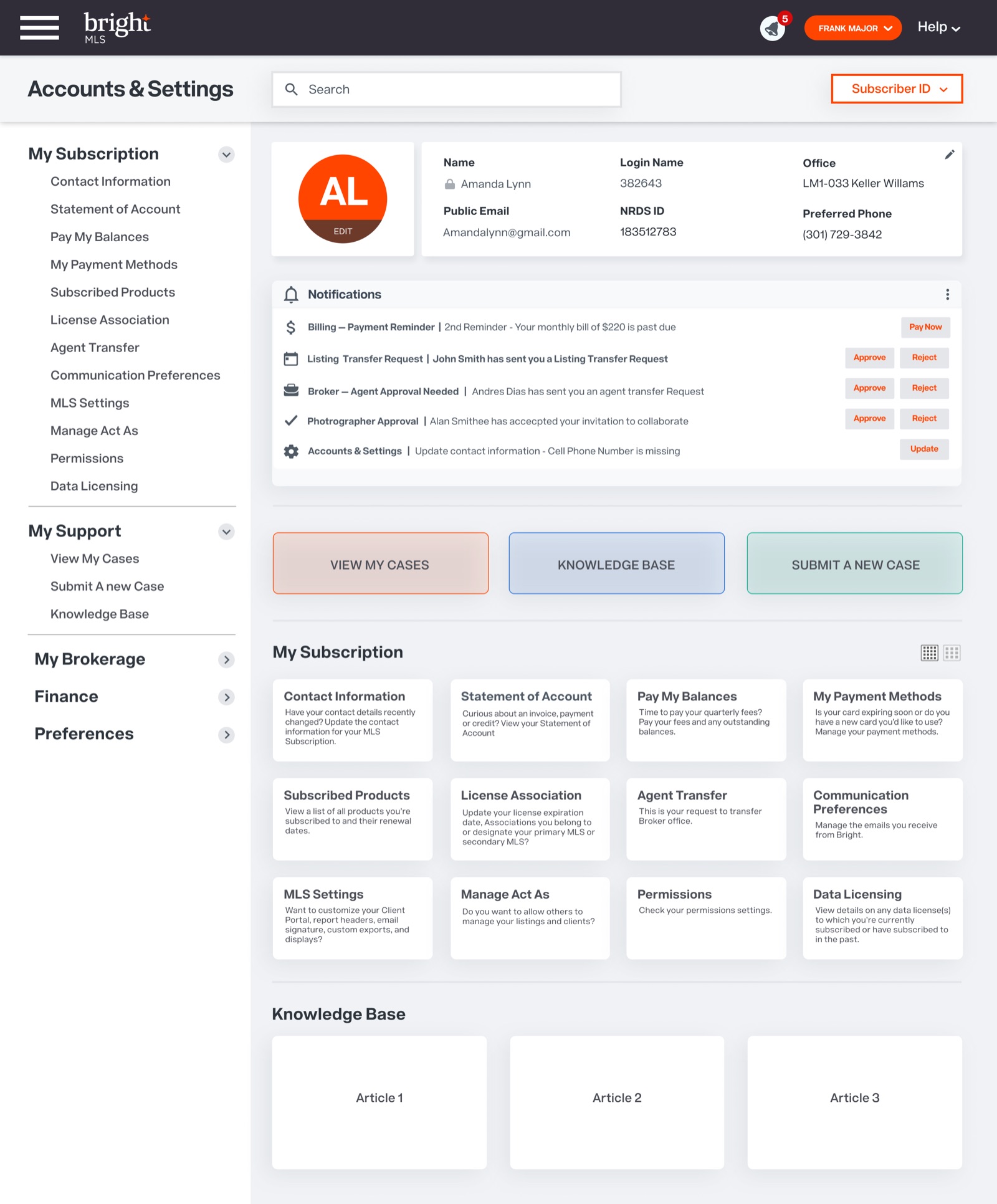
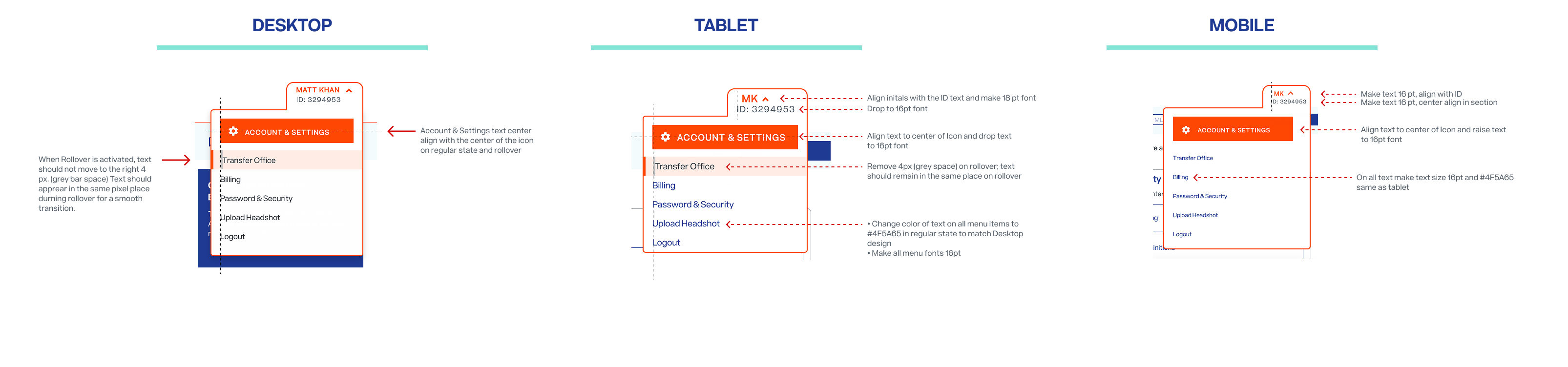
Login, recovery, settings, and navigation are the flows every one of Bright's users passes through. Each was redesigned to be unremarkable in the best sense: fewer decisions, clearer states, no dead ends.

From validated concept to go‑to‑market
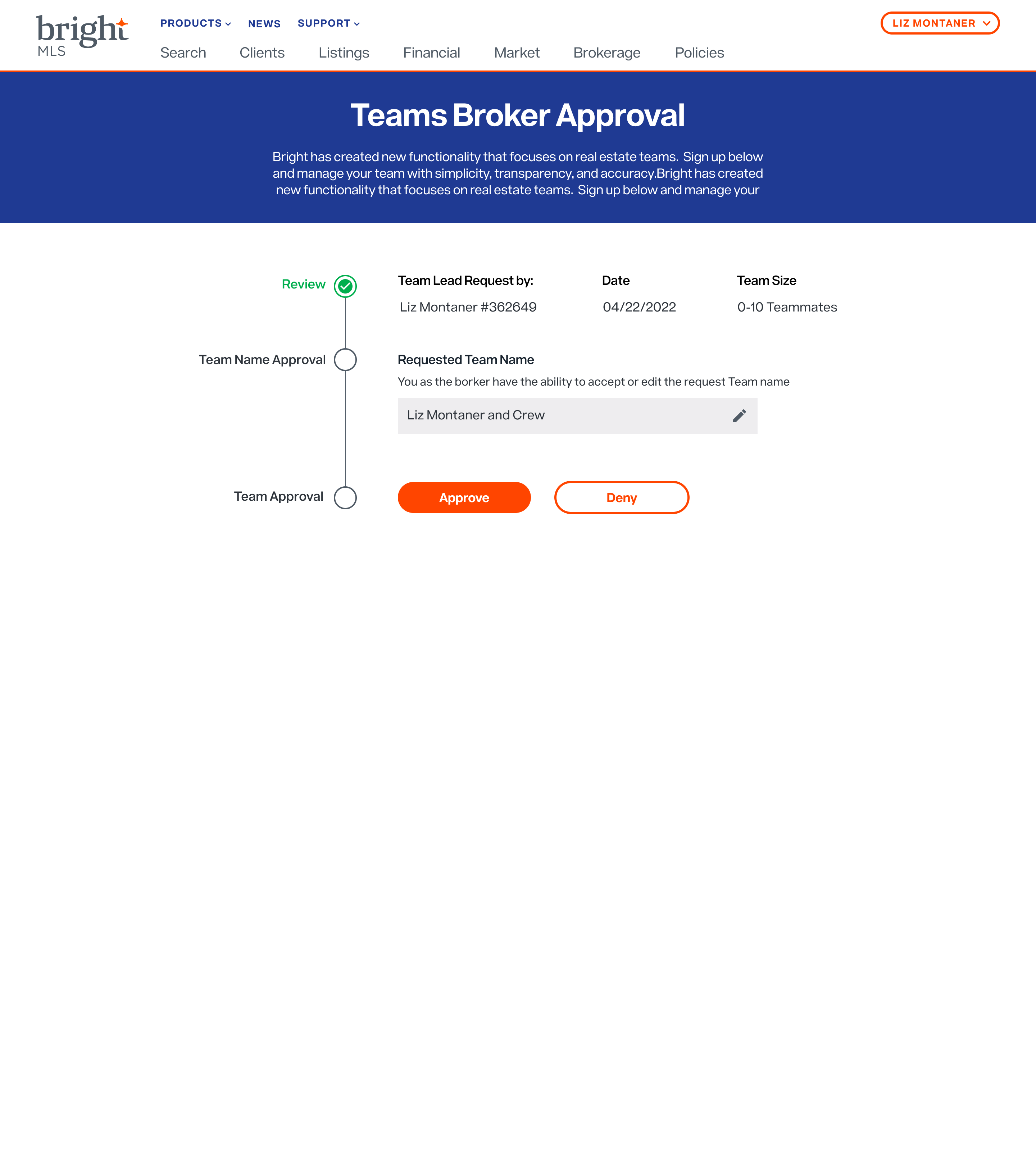
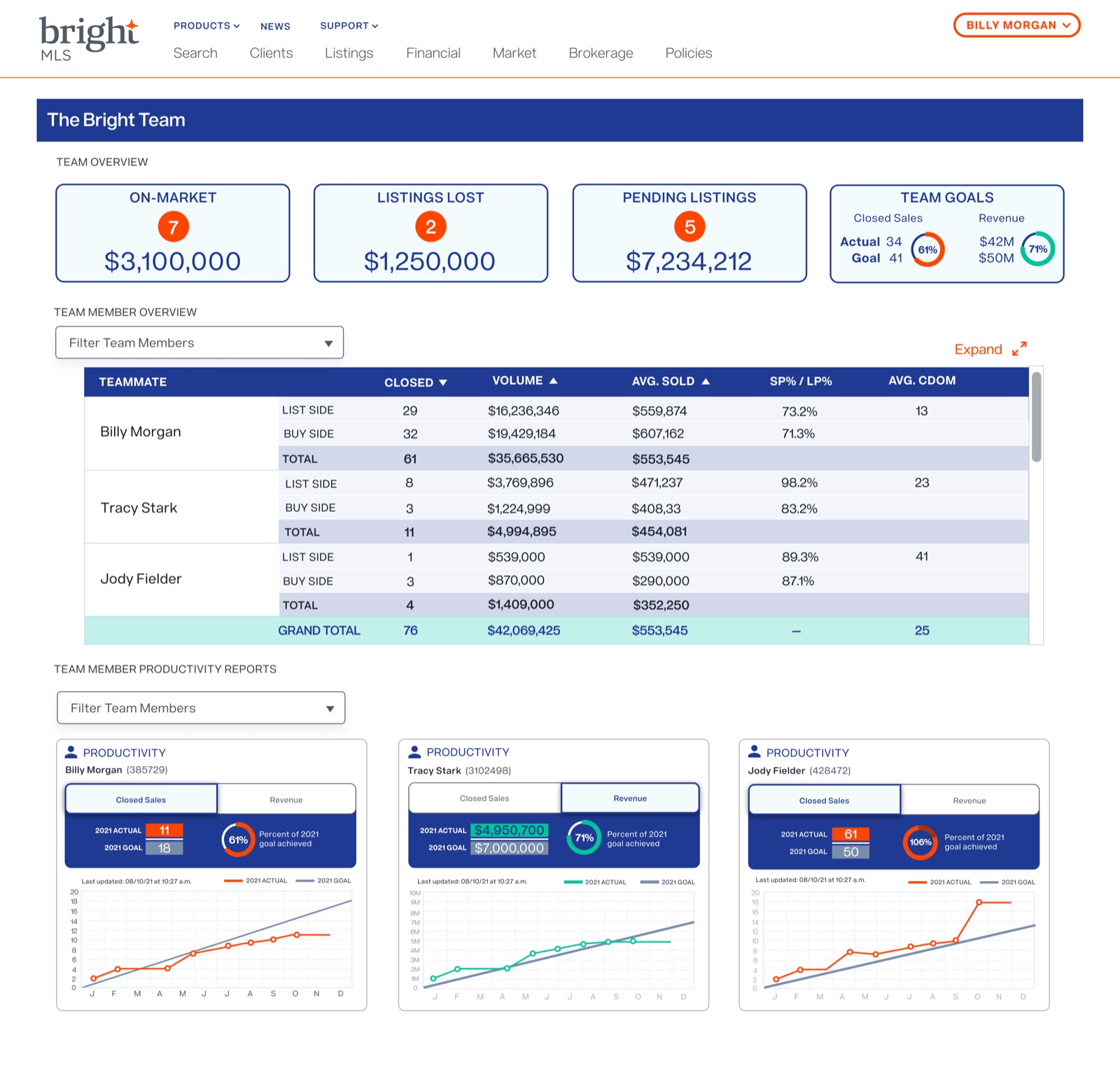
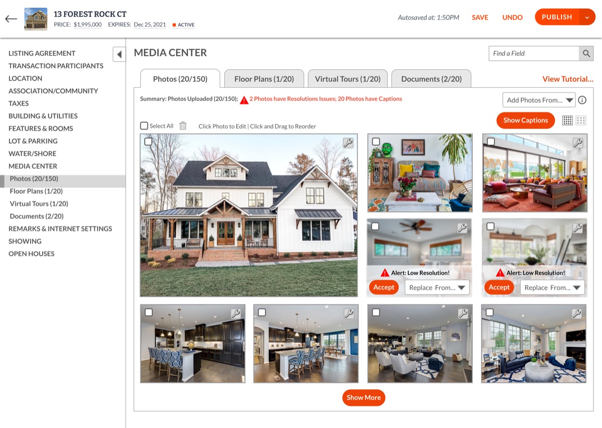
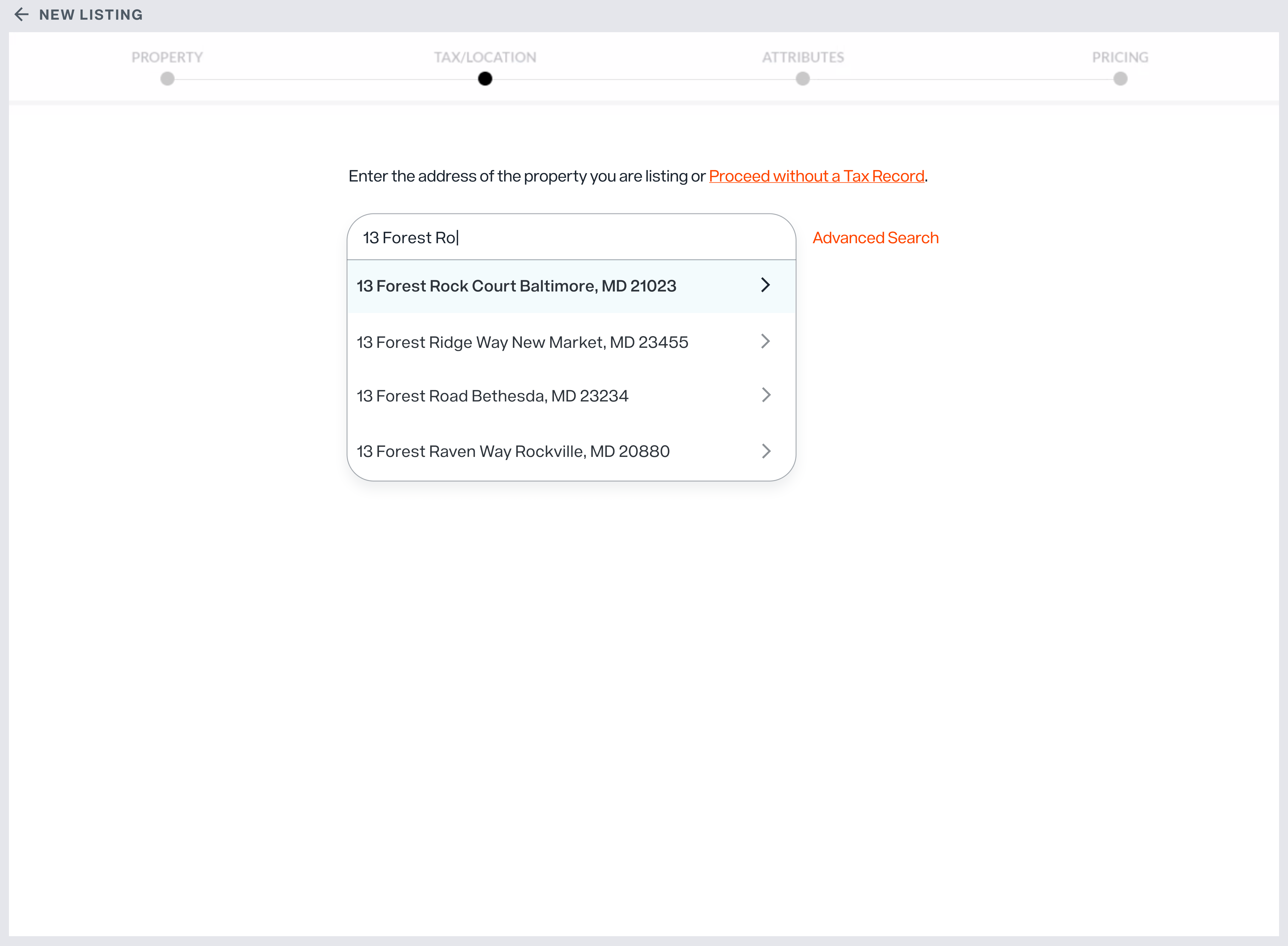
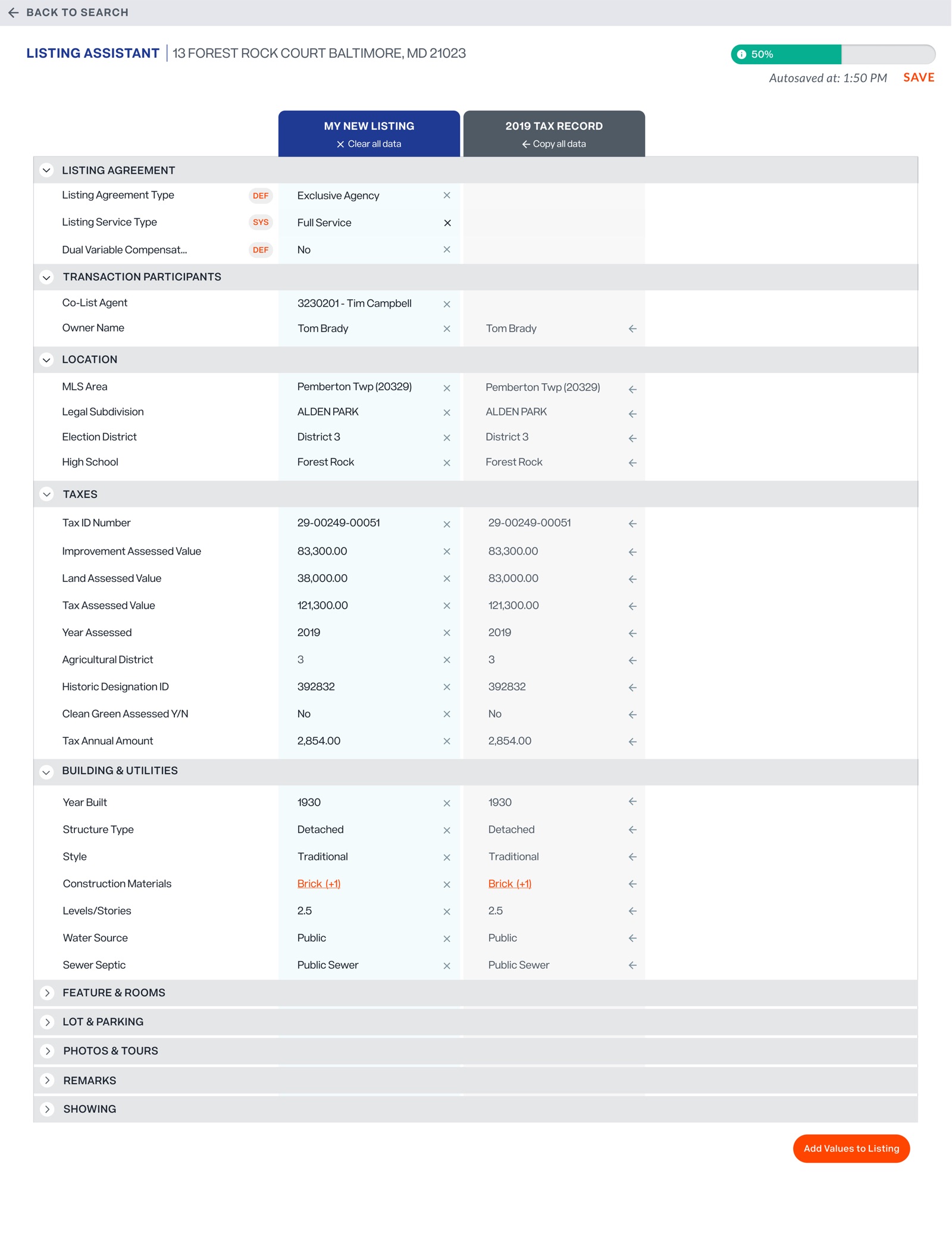
Working across eight teams, I designed three new products from research through launch. Teams gave brokerages shared listings with real governance. Media Center centralized property photos, videos, and marketing materials. Listing Assistant attacked the most hated task in the workflow — data entry — by letting agents build a listing from the public record instead of a blank form.

A process is only real if the organization buys it
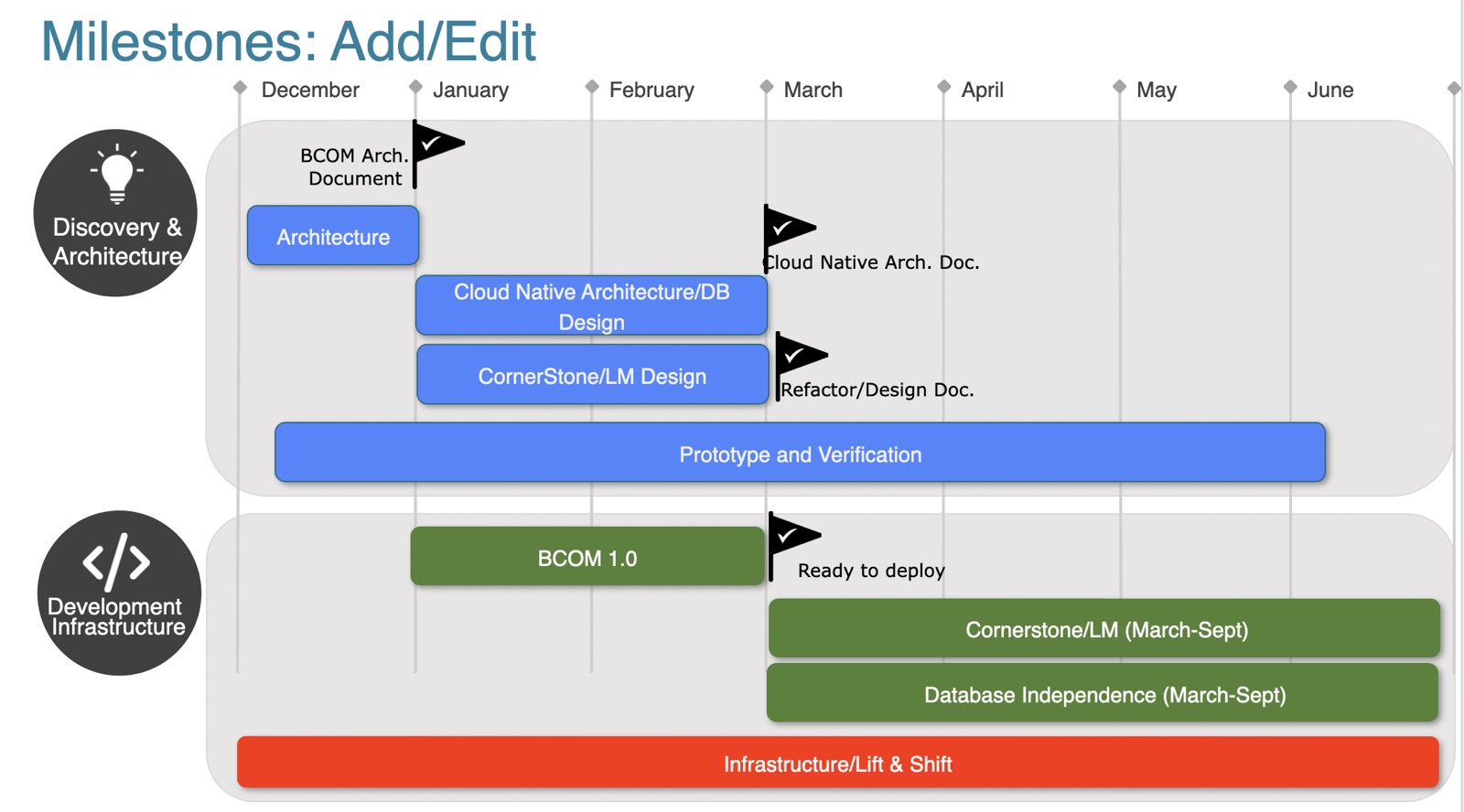
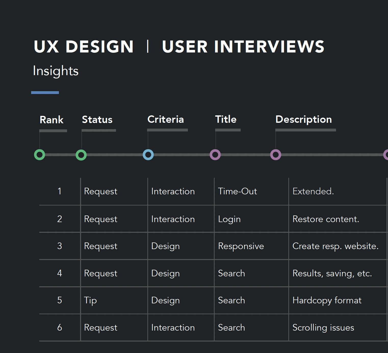
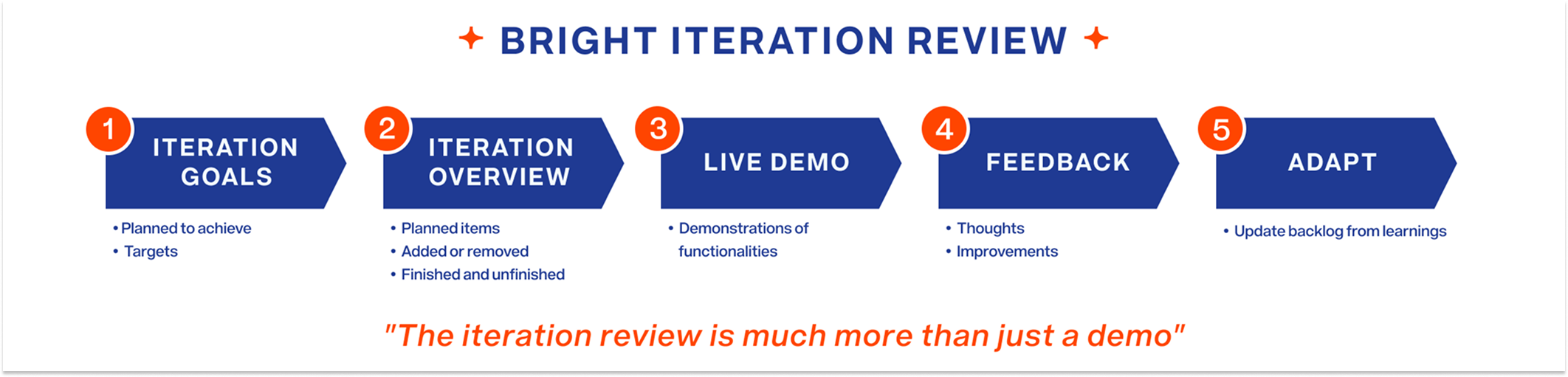
Establishing a repeatable UX practice at a data company meant marketing it internally: decks that made the method legible to leadership, research findings packaged so product teams could rank and act on them, and an iteration-review ritual that turned demos into decisions. These are the actual artifacts that carried the practice through the organization.
A UX practice the organization could keep
By the end of 2020, UX had become a structured, measurable part of the organization. The work improved the experience for 100,000+ users across the entire platform; design‑to‑development moved five times faster under the standardized process; two validated premium concepts opened a projected $1M–$9M in annual revenue; and five platforms operated under one design system.


"Matt demonstrated exceptional perseverance and professionalism through a period of major organizational change. He independently led UX initiatives, integrated vendors seamlessly, and helped establish a consistent, repeatable UX process that elevated our design maturity."
Product Manager, Bright MLS
What I'd carry forward
The most durable output wasn't any single screen — it was the practice: research with real users on a cadence, decisions documented against evidence, and a system that made consistency the default. If I did it again, I'd instrument outcomes from day one, so every improvement shipped with its own measurement built in.