A personal brand that books itself
Digital presence and portfolio for a solopreneur
Beccah Bartlett offers yoga, healing and coaching programs for emotional and spiritual wellbeing. She needed a more polished brand presence and a streamlined digital platform to clarify her offerings, improve the flow of information and make scheduling easier for clients.
I redesigned her site with a user centered approach, focusing on clarity, warmth and accessibility. The new experience includes a cohesive visual identity, simplified booking and checkout flows and custom onboarding forms that make working with her feel seamless from the first interaction.
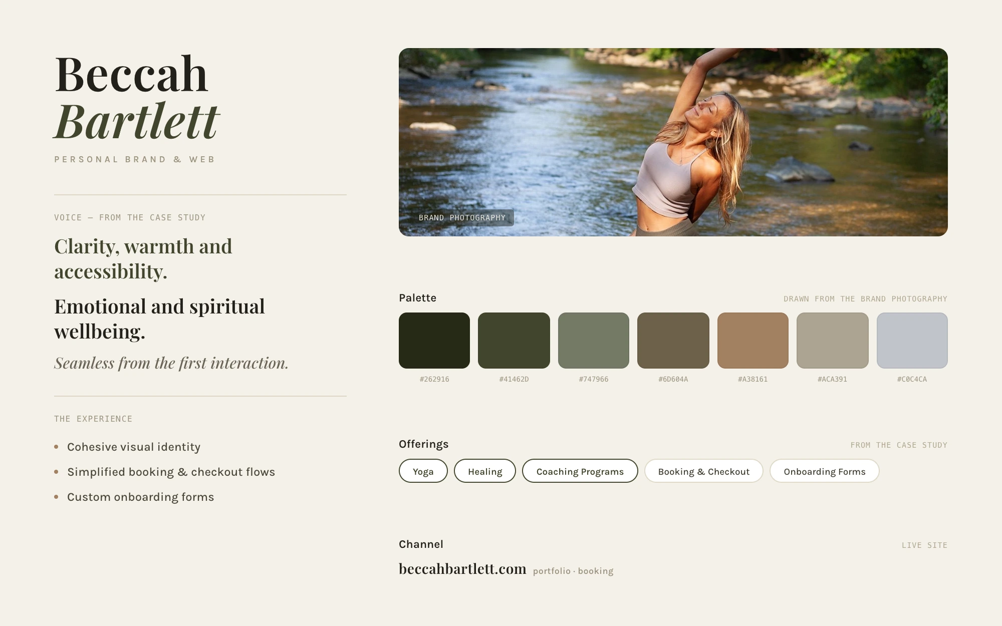
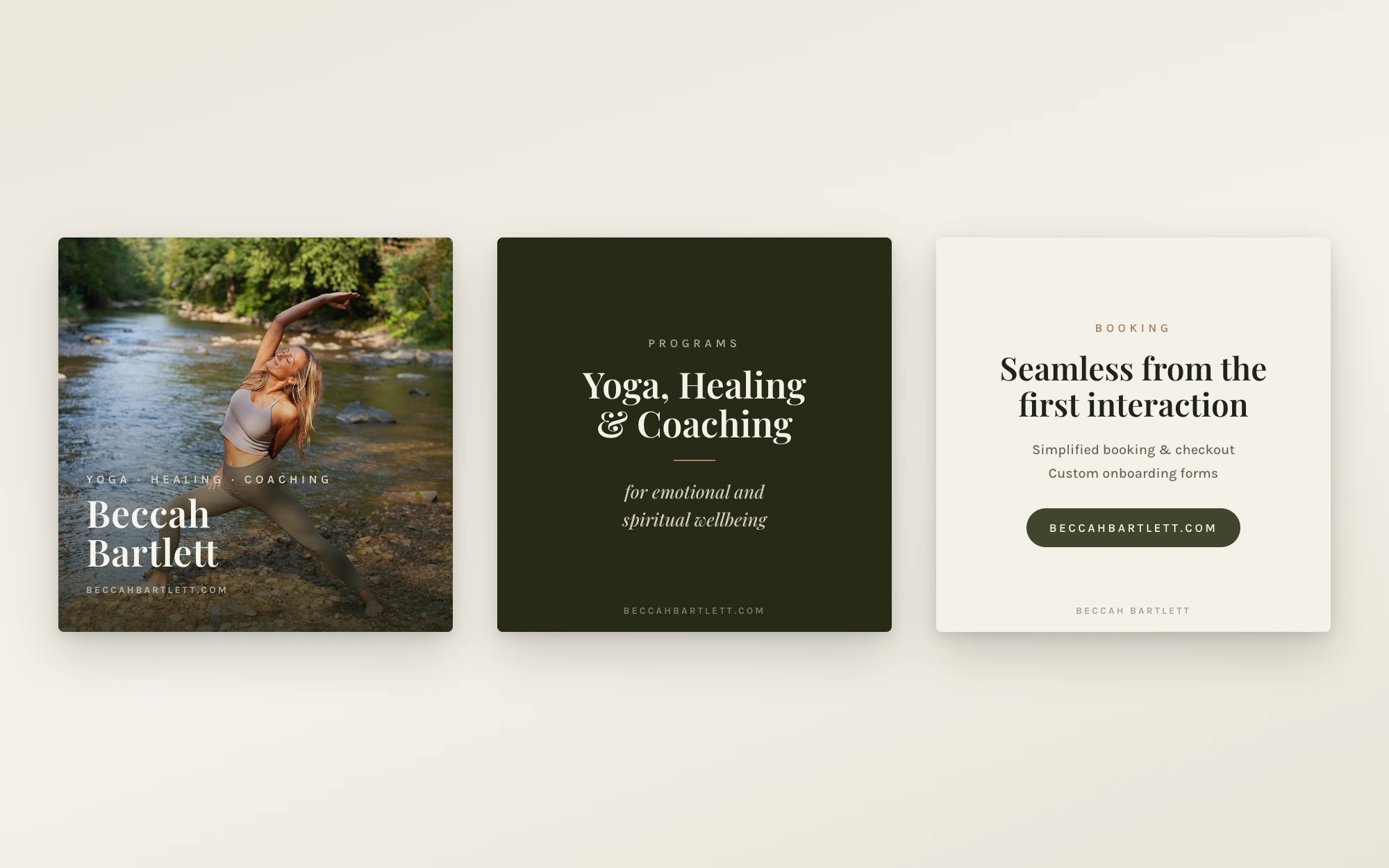
The brand leans on what Beccah already has — warm, riverside photography — and keeps everything else quiet around it: an earthy palette of deep forest, olive, sand and river tones drawn straight from that photography, a classic serif for her name and voice lines, and plenty of light, warm space. The tone follows the design goals of the redesign — clarity, warmth and accessibility.
Below, the system at a glance: a brand sheet built around the real cover photograph, and a sequence of square social post templates set in the same palette — every line drawn from this case study and her live site’s address.